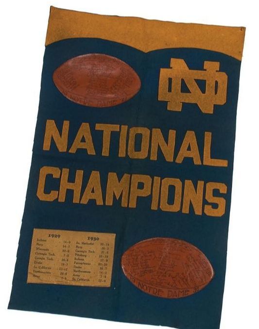
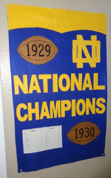
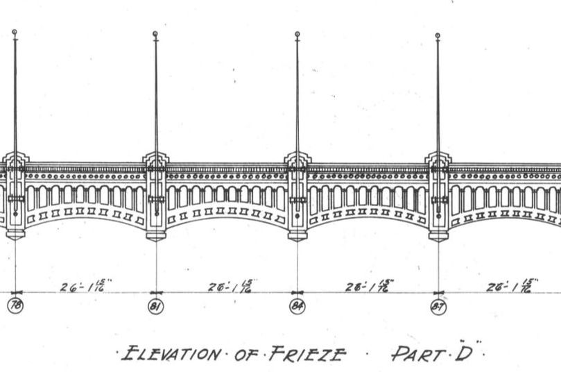
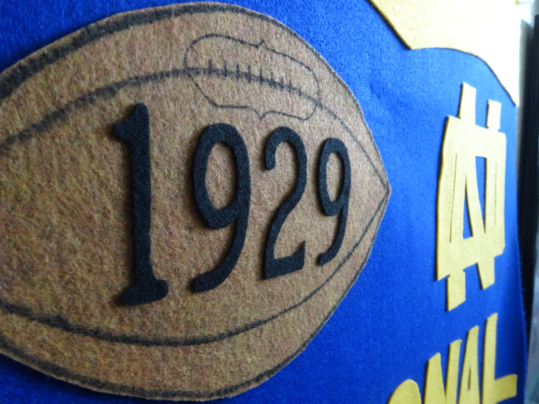
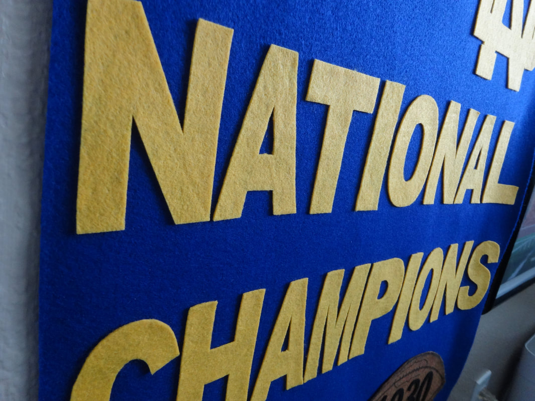
 The designTwo years ago I found this old banner for sale. It celebrates the last two national titles won by Coach Knute Rockne and the University of Notre Dame in 1929 and 1930. Its design is rather unique. In recognition of each championship, a leather football was sewn into the backfelt. Moreover, each football bears the year and facsimile signatures of each team's roster of players and coaches. In the bottom left corner appears a schedule for both years' teams, complete with the final scores of all games played. The school's distinctive "ND" monogram appears in the upper right corner in gold felt, sewn into the navy blue backfelt. Finally, along the top edge a gold header appears that's oddly reminiscent of Yankee Stadium's iconic frieze, seen here:
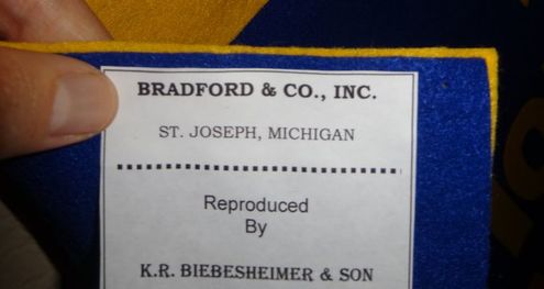
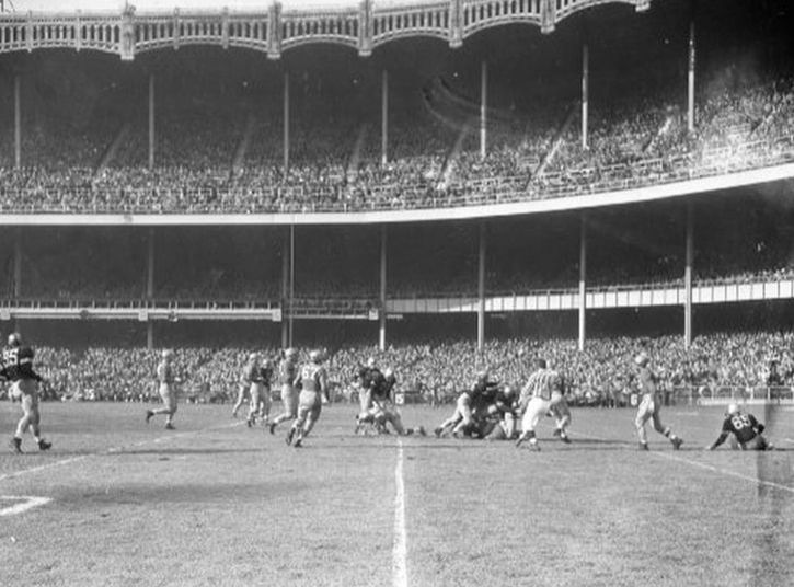
Okay, maybe the Yankee Stadium tie-in is a bit of a stretch. But, in those days, the annual Notre Dame-Army game was huge. Easily the most anticipated game of the year, from a national perspective. And, every other year, the game was played at Yankee Stadium to accommodate the big crowds. As the banner itself notes, Notre Dame played and beat Army at the end of the '29 and '30 seasons, thereby becoming back-to-back national champions. So, who knows, maybe the Yankee Stadium frieze was on the designer's mind when he/she made this banner?  Anyway.... Several of these banners have been sold at auction over the past two decades. Because of this I know the banner measured 35" x 22.5". Not surprisingly, final sales prices have ranged between $1,800 and just under $6,000, depending on the condition. In other words, too much for my wallet! That's why I had to make it myself. The jobThe biggest challenge in re-creating this banner concerned the two leather footballs, and the the facsimile signatures thereon. I knew I could substitute brown felt for the footballs in lieu of leather; but, the signatures?? How was I to reproduce several dozen different signatures; and, on felt no less? I couldn't. So I looked for an alternative. Something that was reminiscent of other felt banners from that era that I could replicate. And I found this: 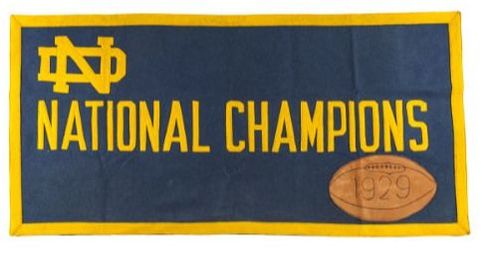 I can't say for sure whether this '29 banner was made by the same manufacturer as the 1929-30 banner; but, they sure look similar. More importantly: this banner has a similar football applique. But, unlike the other with its facsimile signatures, this football simply bears the year of the championship. Which I could easily reproduce. Let me be clear about one thing: I don't like modifying my work from original designs. But sometimes you have no choice. Here, this was my best alternative. Instead of trying to recreate dozens of signatures, I decided to copy this element from this similar design and incorporate it into my reproduction for the 1929 and 1930 team footballs. One other nugget of info from this 1929 banner came in the form of a maker's mark. Sewn into the reverse side appeared the following label: 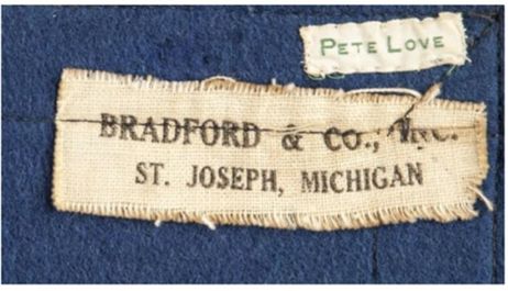 Again, I can't say with certainty that these two banners were made by the same company. But, this seems likely. The lettering used seems to be the same font/style. The blue and gold felt used are the same shades. Both contain similar footballs made from leather. Both are 35" in length. Moreover, in my research, I've come across one other felt banner celebrating the 1929 Notre Dame football team bearing this label. So, it seems reasonable that Bradford & Co. would have desired to make a combination banner a year later after the team secured the 1930 title, right? After the footballs, the next challenge was the schedule. I believe the original banner featured a paper schedule. If so, it was likely glued to the backfelt. It's also possible that the schedule was some type of cloth that was sewn into the backfelt. While I'm not clear what material it was made from, I am certain the text was printed using a Cooper Black font/typeface. 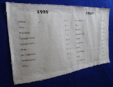 I re-created the schedule in Microsoft Word, using Cooper Black font. That was easy. But when I printed the image on plain white paper, it looked too new. I then tried using a heavier resume paper that was egg shell white, but the end result still looked like paper that came out of a home printer. So I tried some of the linen I used on previous projects that was antique white. I glued a piece to some computer paper, placed it in the paper tray, and hit print. To my astonishment, it worked! The printer printed the schedule atop the linen, and the linen separated nicely from the paper afterwards. All that was left was the header, monogram and text. The monogram was tricky. If you look carefully, it's not the same monogram used by the university today. (The "D" is a bit narrower.) I had to draw this a few times before I got it just right. Thankfully, the text was easy to produce because the block-style lettering is easy to cut-out. After a few long nights, it was time to glue everything together. The resultI am thrilled with how this banner turned out. By far, this was the biggest project I have taken on. In some ways, that made this easier--especially when it came to cutting felt lettering. While it's not a 100% faithful reproduction of the original, the modifications I made were both necessary and consistent with similar works from the same era.
Note: All unquoted material on these pages is © 2019 K.R. Biebesheimer & Son. All rights reserved. Short excerpts may be used after written permission obtained and proper credit is given. ♦♦
0 Comments
|
AuthorIn 2018 I started a separate website called Pennant Fever dedicated to 20th century felt novelty manufacturers. It focuses on these companies' history, products, etc. Eventually, my interest in these businesses inspired me to start making my own pennants. THIS site you're currently viewing, Pennant Factory, is where I'll showcase some of the felt projects I've taken on. Most are reproductions of real pennants once for sale to the public. I've done my best to re-create the originals as authentically as possible based upon surviving photos, known dimensions, etc. Others are my original work, intended to look like the styles of yesteryear. Some turned out better than others. See for yourself. Enjoy! -KRB Projects:
All
Archives
February 2024
|
 RSS Feed
