

|
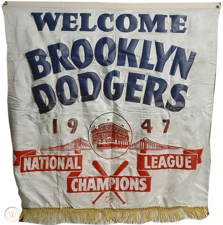
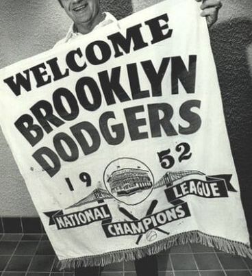
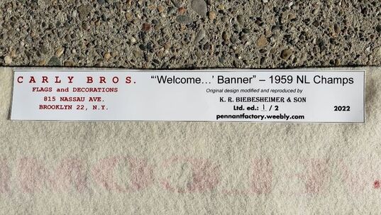
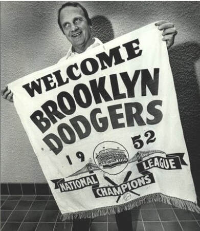 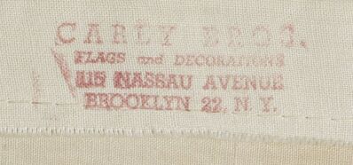 Above: Former major leaguer Bobby Morgan poses with his '52 championship banner in 1978. Below: On some banners, but not all, a maker's mark from Carly Bros. was stamped on the reverse in red ink. | Unlike your typical novelty banner, these banners were not made of felt. They were made from woven canvas. Along the top ran a canvas header, punctured by two brass grommets so the item could be easily displayed. The graphics were screen printed on to the canvas, just as they would be on a novelty pennant or banner of the day. Some even featured a color gradient, transitioning from red to blue graphics that could only be replicated via the screen printing method. There were other nice touches worth mentioning. For at least the first four banners--1947, 1949, 1952, and 1953--each banner featured a golden fringe trim sewn on to the footer. This was a really unique characteristic that made them look a bit more regal. For years, the maker of these fine banners was unknown to me. Then, I came across a '55 banner that sold at auction not too long ago. The listing included a rare photo of the reverse; and, stamped along the back of the header appeared a maker's mark: "CARLY BROS. / FLAGS and DECORATIONS / 815 NASSAU AVENUE / BROOKLYN 22, N.Y." |
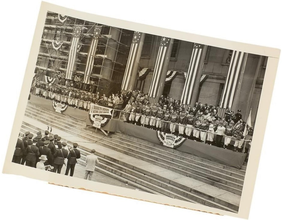
So why is it a "Welcome...' banner" you're wondering? Good question. I wondered about that question for years, too. Turns out, the borough of Brooklyn held a pep rally of sorts immediately after the Dodgers clinched the National League pennant. The ceremony was held in front of Borough Hall and the guests of honor were, of course, the Brooklyn Dodgers. Here's what one of these events looked like:
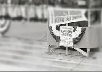 |  |
Bottom/left: Close-up of the center banner clearly reveals: it's by Carly Bros.
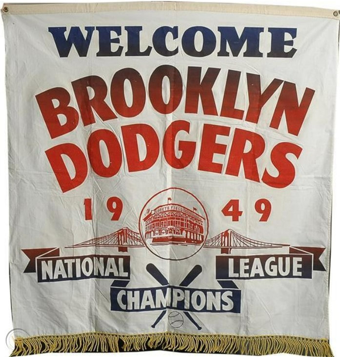
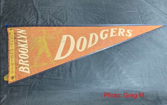
Bottom/right: Surviving Carly Bros. banner from 1949. Perhaps one that hung outside Borough Hall during the celebration?
 |  |
 |  |
 |  |
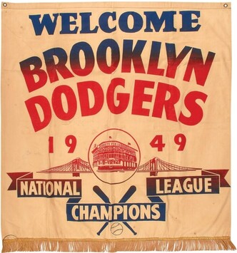
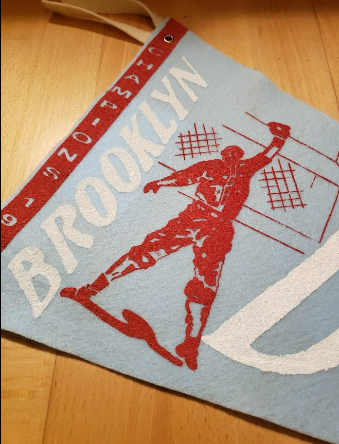
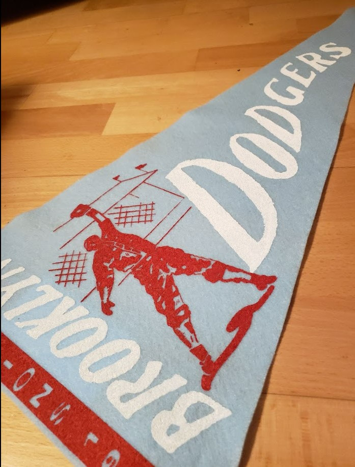
As you can see, lots of banners. Among them, the '52 and '53 banners are probably the rarest. There was even a '51 (phantom) banner made ... but we don't need to rehash all that Bobby Thomson nonsense again here in this piece. And, you may have noticed what appears to be a "WELCOME CHAMPION BROOKLYN DODGERS" variant. This one's really rare, too. Most likely this one was made sometime after the team won game #7 of the 1955 World Series; but before the start of Spring Training the following year. I'm not 100% certain it was manufactured by Carly Bros., but the size, letter font, and use of golden fringe trim have convinced me: it most likely was.
I've always wanted to own one of these banners. Hell, I'd even settle for one of those '51 phantom banners! But, I'm not about to mortgage my home to purchase one of these.
And while I seriously thought about reproducing one of my own, I wanted to come up with something a bit more original. Something like an event where the Dodgers really would have been welcomed....
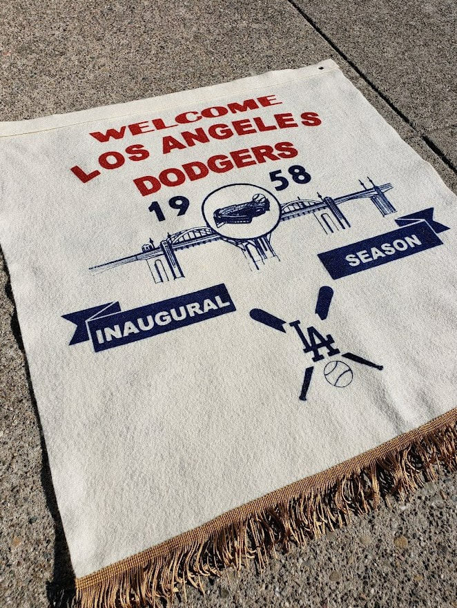
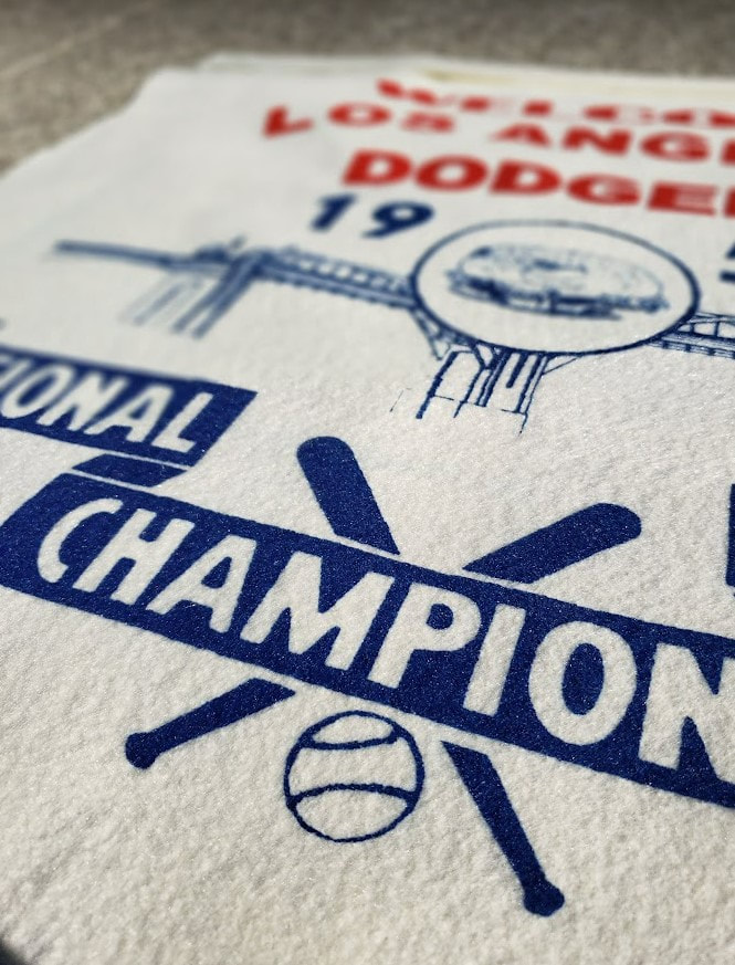
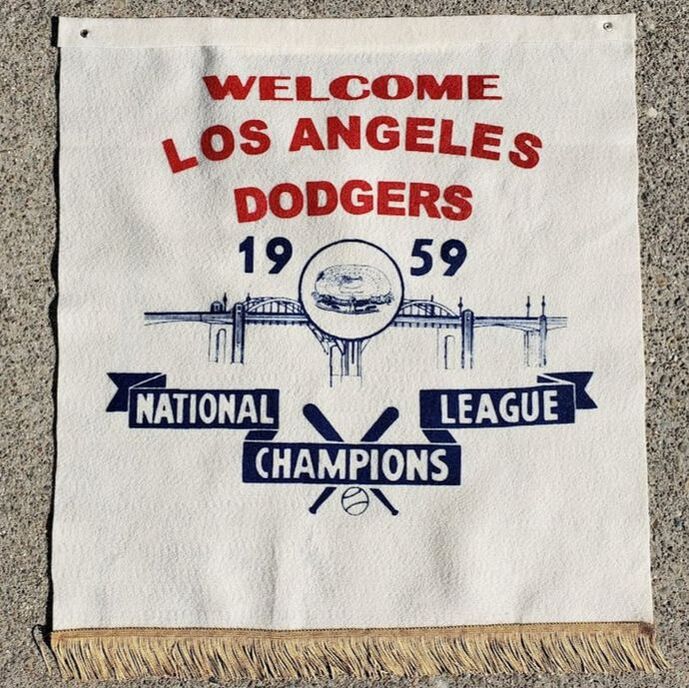
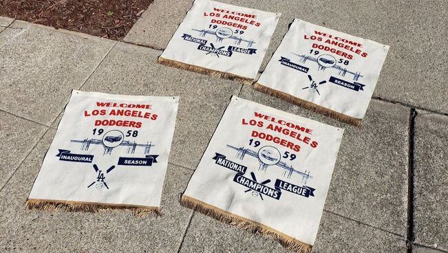
Like, for example, the team's arrival in Los Angeles at decade's end, when the baseball-starved city of angels got its first taste of professional baseball; and salutations for the city's new team were abundant.
The design
That wasn't the problem. The real problem was Los Angeles doesn't really have any famous bridges. Or, so I thought....
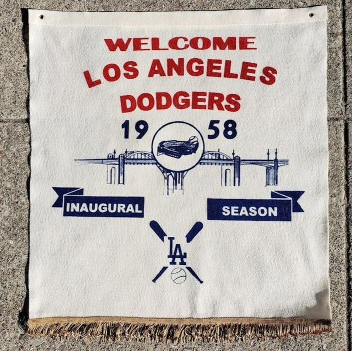
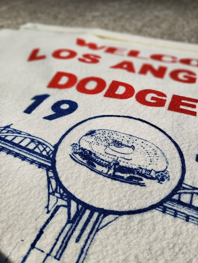
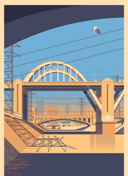 The Los Angeles River is crossed by no less than three historic, art deco concrete bridges built in the 1930s--all visible in this scene. Source: georgetownley.com. | Okay, so it's not London's Tower Bridge. It's no Golden Gate Bridge. It wasn't beautiful; nor was it an engineering marvel by any stretch. Nevertheless, for eight decades it was one of the most photographed bridges in the world; and because of its proximity to Hollywood, it probably deserves a spot on the Walk of Fame--because it appeared in so many films and commercials over the years. It was officially called the Sixth Street Viaduct; but most Angelenos referred to it as the Sixth Street Bridge. Built in 1932, the Sixth Street Viaduct connected downtown Los Angeles with east LA. Specifically, it connected E. 6th Street with Whittier Boulevard. To do this, the structure crossed the Los Angeles River, a railroad yard, and US Hwy. 101 before landing in the industrial neighborhood of Boyle Heights. It looked old. It looked gritty. Although no tourist would have dared hang out under it; it became the perfect location for filming. |
In its day, more than a hundred feature films used the Sixth Street Viaduct as a backdrop for a scene or two. Twice as many car commercials were filmed on its four lanes of traffic. In a town full of movie stars, she was star in her own right. Sadly, decades of wear and tear had caught up to the bridge by the 2000s, when her concrete was literally crumbling apart. In 2016, civic leaders made the difficult decision to close and demolish the Sixth Street Viaduct, largely for seismic reasons. In 2022, a grand new replacement bridge opened in its place.
So, in memory of the grand old bridge, I felt it perfectly appropriate to honor her one last time-- on felt this time, not film.
The result
Perhaps they would've looked something like these?
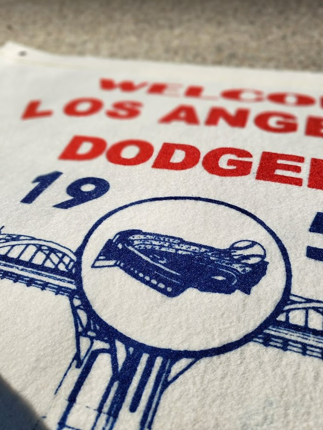
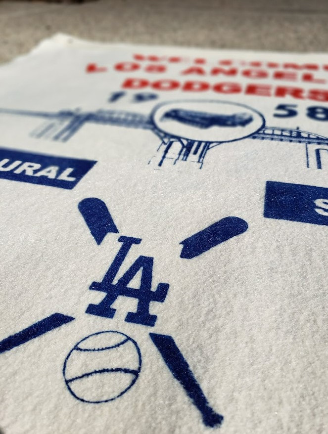
V1: 1958 LA Dodgers - Inaugural Season
 |  |
 |  |
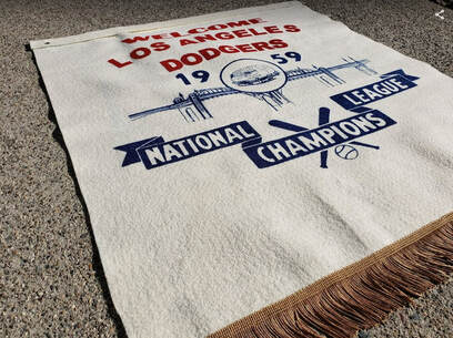
V2: 1959 LA Dodgers - National League Champions
 |  |
 |  |
Interested in one?
♦♦
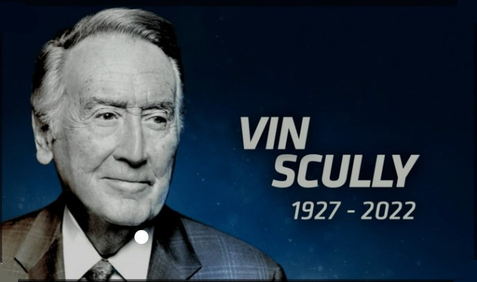
The Voice
Truth be told, I've always wanted to make a tribute pennant or banner commemorating Vin's life. So, I looked into it some, expecting to find several. To my surprise, despite 67 glorious years as "The Voice of the Dodgers," only one pennant was ever made featuring Vin's name and likeness. Here it is:
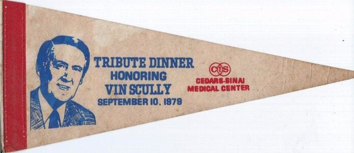
That's it? The man dedicated his life to the game of baseball, and this is the pennant made in his honor? Notwithstanding all the other honors the man received during his lifetime, this pennant ... it's a bit underwhelming is all. I mean, c'mon, a 5" x 12" mini pennant promoting a Cedars-Sinai fundraiser? We can do better than that, right?
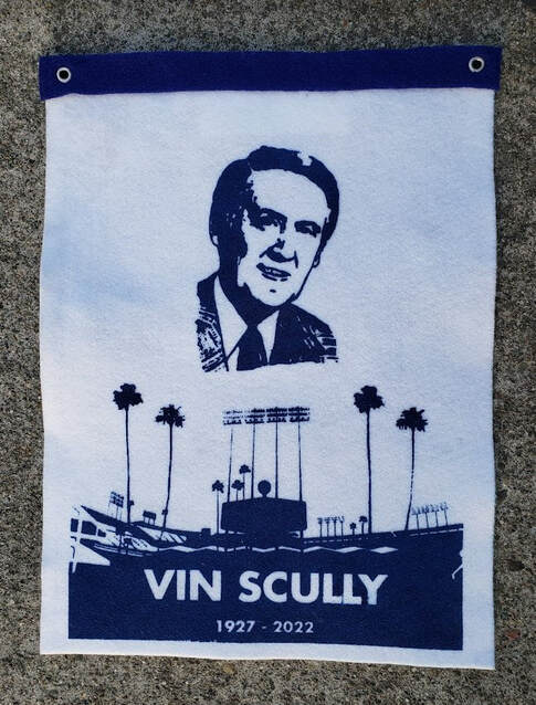
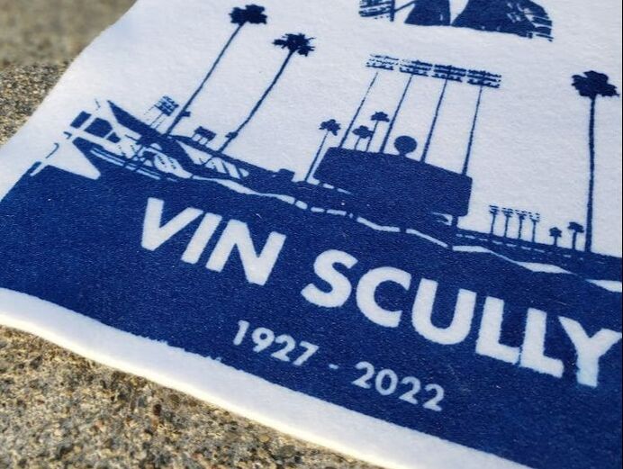
Yes. We can. So I made him something even better: a banner.
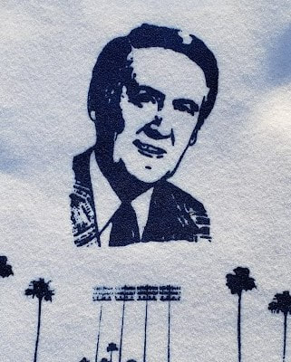
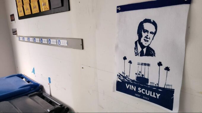
The result
Vin, this one's for you!
 |  |
Interested in one?
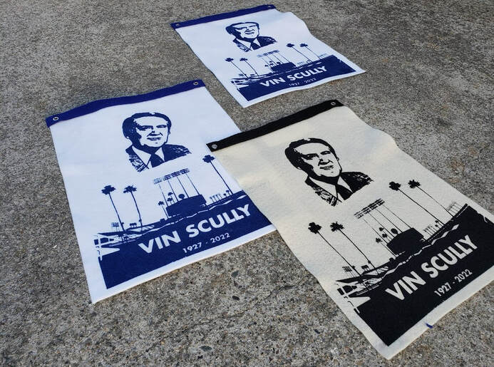
No reasonable offer will be refused. Send me a note via the "GET IN TOUCH" tab and it's yours.
♦♦

Background
Early 20th century pennants were mostly sewed together from contrasting pieces of felt. This required a fair amount of sewing, depending upon the design. Sewing machines and die presses helped speed things up; but, at the end of the day, much of the labor was performed by hand.
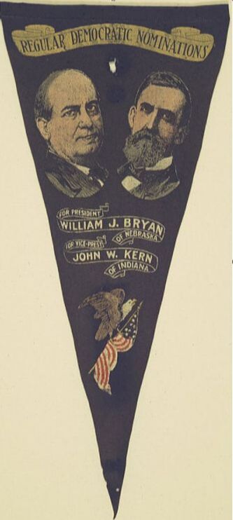 Above: You are looking at perhaps the first ever screen printed felt pennant. Manufactured by The Reproduction Co. of New York, NY in 1908 for presidential candidate William Jennings Bryan, this beauty exhibited crisp detail never before seen on a felt novelty item. | By about 1910, however, things began to change. As early as 1908, pennant makers began adopting the screen printing method for the production of felt pennants. For those lucky manufacturers with access to this patented process, it changed their fortunes. Now, pennant lettering could be screened on; no more cutting/sewing of each letter. Moreover, the process opened the doors to colorful, detailed graphic illustrations that could never be replicated using the relief/letterpress method, as others had been forced to resort to. Finally, screen printing allowed manufacturers the ability to quickly reproduce the same image over and over again with a degree of consistency and efficiency never before seen. But, amid all the advantages screen printing offered pennant makers, there was still one pesky problem it had yet to solve: you still had to sew the pennant's spine and tassels on. Which meant you still needed sewing machines; and skilled seamstresses to operate them. So, by decade's end, pennant makers began looking for a solution. Several makers came up with an answer: screen print the spine on. I call these "faux spines" because, from a distance, they can pass as real spines made from a contrasting strip of felt. Faux spines were widely adopted for use on promotional pennants, i.e., pennants that were basically tied to some promotional giveaway. Look for them especially on mini promo pennants circulated in the 1910s, and afterwards. |
 | 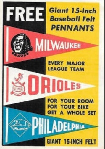 |
Above/right: This 1959 promotional insert from Topps baseball cards showcases the promo pennants being offered at mid-century. Note the faux spines. By the late 1950s, tassels were far less important to consumers; so nobody bothered to even paint them in.
Faux spines worked for small promo pennants where the consumer wasn't expecting much in terms of craftsmanship. But, for full size pennants ... not so much. The problem was, until the late 1940s, consumers expected full size pennants to come with at least two pairs of real, cloth tassels; and these tassels had to be secured to the pennant somehow. Typically, tassels were secured by the two stitches running the length of the spine. So, if you employed a faux spine; you generally had to nix the tassels, too. Or else, find some other way to secure them....
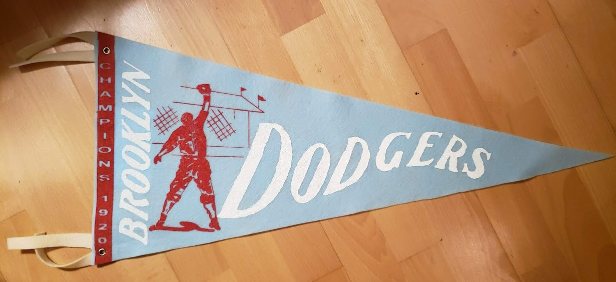
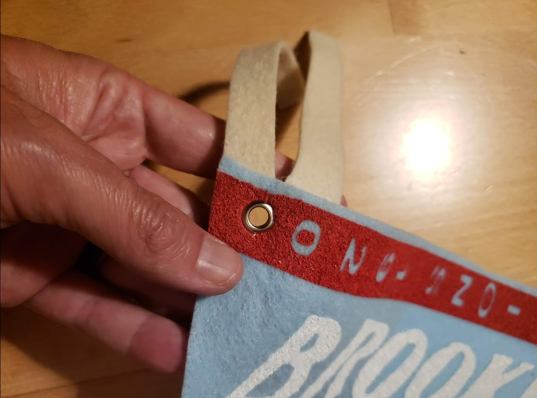
One pennant maker came up with the perfect solution. Why not screen both the graphics and the faux spine on; then secure a real pair of of cloth tassels with a pair of brass grommets? In effect, they pioneered a design that yielded a full size pennant, with tassels, requiring no sewing whatsoever.
I've named it a "grommet pennant"; but, I may as well have named it "a pennant maker's pennant."
Unfortunately, this innovative maker's identity remains a mystery as of the time of this writing. We do know that they made a large number of league championship pennants for both National and American League pennant winners throughout the 1920s and 30s. A common feature seen across the series is the inscription of text running vertically down the length of the faux spine, declaring the team as "CHAMPIONS" followed by the the year of production. Ostensibly, these were made for and sold primarily outside World Series games. Here's the few I know of that have surfaced over the years:
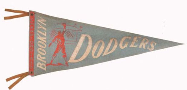
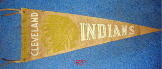
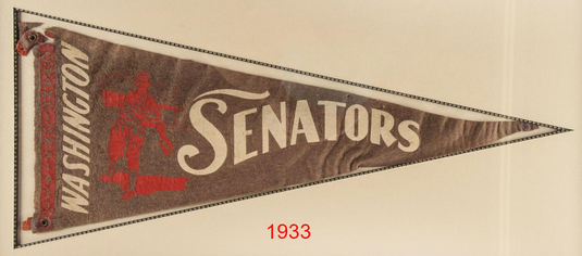
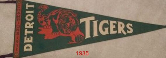
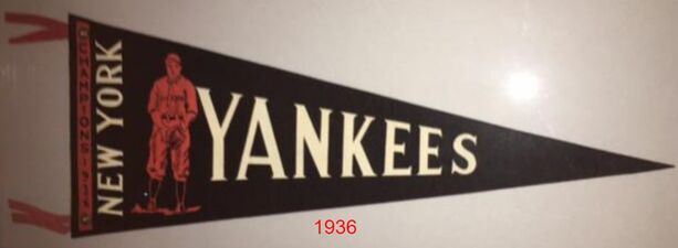
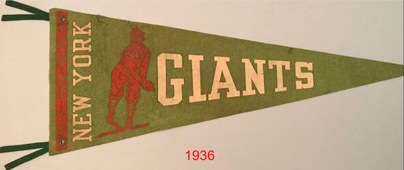
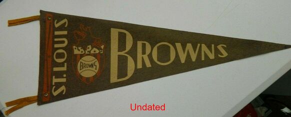
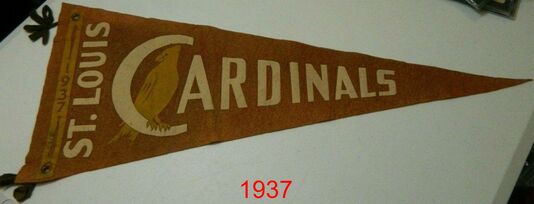
If you noticed a plethora of St. Louis representation in the above mix, you're not alone. It seems likely that, whoever this manufacturer was, they were located in the midwest--perhaps in St. Louis. If so, I know of only one pennant maker in St. Louis doing business in the 1920s: St. Louis Button Co. For the most part, they manufactured pinbacks; including baseball pinbacks for the St. Louis Browns and Cardinals. But, they were listed in multiple trade journals of the day as a maker of felt pennants. Therefore, it seems reasonable to believe they made a baseball pennant or two during that time frame. So, who knows? Maybe they're our mystery maker?
  Above: Close-up of the above St. Louis Browns grommet pennant, as seen from the front side. Brass grommets gave the pennant's overall appearance more of a nautical look, as you might see flown from the mast of a yacht. Below: Same pennant, as seen from the reverse side. These tassels became locked in place the moment this grommet was punched. | Grommets offered a happy medium for pennant construction. Consumers could enjoy a full size pennant with rich, detailed polychromatic graphics; and its manufacturer could crank these out by the sheet, with minimal cutting; and absolutely no sewing. Everybody wins! (Unless you were employed as a seamstress, that is.) Additionally, grommets allowed the consumer a handy way to hang their pennant back at home. Technically, you could tack these to your bedroom wall without leaving any new holes behind in the pennant. Finally, grommets seemed just as secure, if not more secure, than sewed spines. You never had to worry about the stitching coming loose. Once punched in place, the tassels were forever bonded to the felt. |
Yeah.
I didn't have $34.50 to spend on that 1920 Brooklyn Dodgers pennant, so that meant: I'd have to make my own.
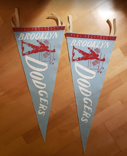
The result
This was the first pennant I've ever made that didn't require any sewing (or, felt glue, my preferred substitute).
 |  |
 |  |
Interested in one?
Make me a reasonable offer, and it's yours. But hurry; supplies are limited. Send me a message via "GET IN TOUCH" and we'll figure the rest out from there.
♦♦
The style
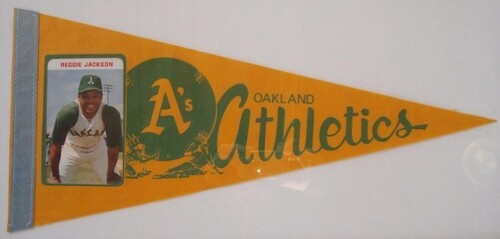
Beginning with the Los Angeles Lakers' NBA championship in 1988, and continuing through the Houston Rockets' NBA championship in 1995, Salem produced a caricature pennant commemorating most NBA and MLB championship winning teams. They were everything that their individual player pennants were--they just included the entire team drawn in caricature, often while holding the trophy they had just won. They were every bit as fabulous as their individual player pennants, and then some! Here's what they looked like:
For reasons unclear to me, Salem did not make a world champs pennant for the '88 Los Angeles Dodgers; the '90 Cincinnati Reds; the '93 Chicago Bulls; or the '94 MLB World Series winner (because the World Series was cancelled that year). Additionally, it should be noted that, as with the individual player caricature pennants, WinCraft continued making world champ caricature pennants on their own, beginning with the '95 Atlanta Braves.
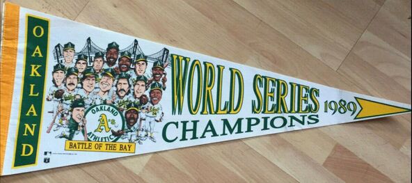
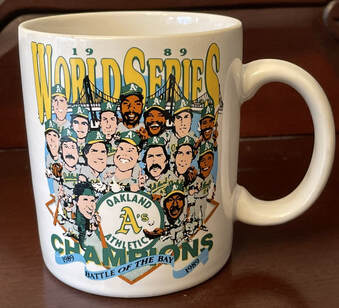
But if you ask me, nothing beats the signature look of the early world champ pennants Salem cranked out in the late 1980s. And, among these, I've always appreciated the '89 Oakland Athletics "BATTLE OF THE BAY" version. This was the only MLB world champs pennant to be made in the signature style Salem was known for; the subsequent versions for the Minnesota Twins (1991) and Toronto Blue Jays (1992, 1993) look a bit too contemporary for my liking. Additionally, I like this pennant because the artist included a depiction of the San Francisco-Oakland Bay Bridge in the background; an iconic bridge that continues to unite the two cities/teams that played in that year's contest. Although the pennant is actually quite tough to find these days, the t-shirt and coffee mug are more common.
 | 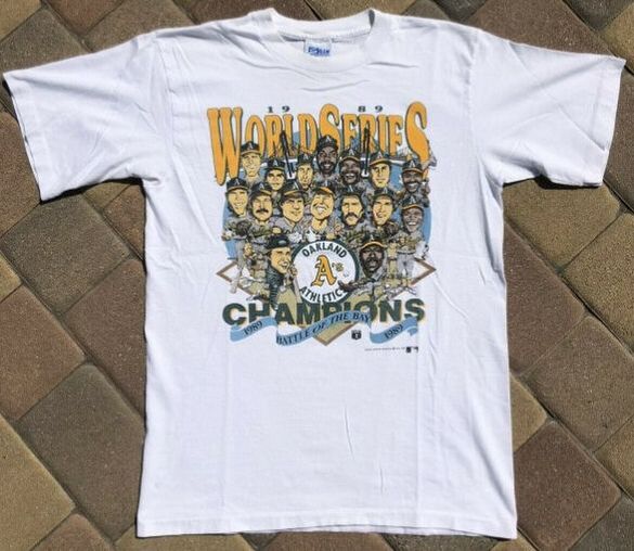 |
Above/right: Although Salem did make caricature pennants, they were more known for their caricature t-shirts; many of which were given to the players and worn by them at the parade that followed their championship win.
The result
This one was a bear to create; but, at the end of the day, I'm quite happy with the result.
 |  |
Interested in one?
For a look at my Clayton Kershaw caricature pennant, click here.
♦♦
The style
 |  |
 Above: This ca. 1989 excerpt from a Salem Screen Printers catalog showcases the company's new line of caricature pennants commemorating the NBA, MLB, and NHL's biggest stars. | Between 1988 through 1991, Salem made and sold the hottest pennants on the market. All were easily identifiable because they took on a fairly consistent look: on the far left, along the spine, the player's team name appeared, written vertically; next came the player's caricature, which often depicted a comedic rendering of the player's features, e.g., oversized head, dangly legs, radiant smile, etc.; next came the player's name written in 3-D block lettering, followed by their team's logo, and finally, the player's number. Thanks to the stable of talented artist Salem employed, these pennants exemplified some of the best artwork ever to appear on felt. |
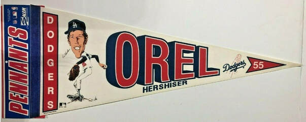
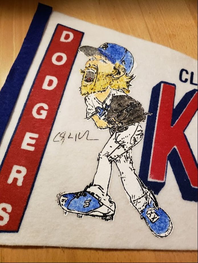
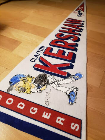
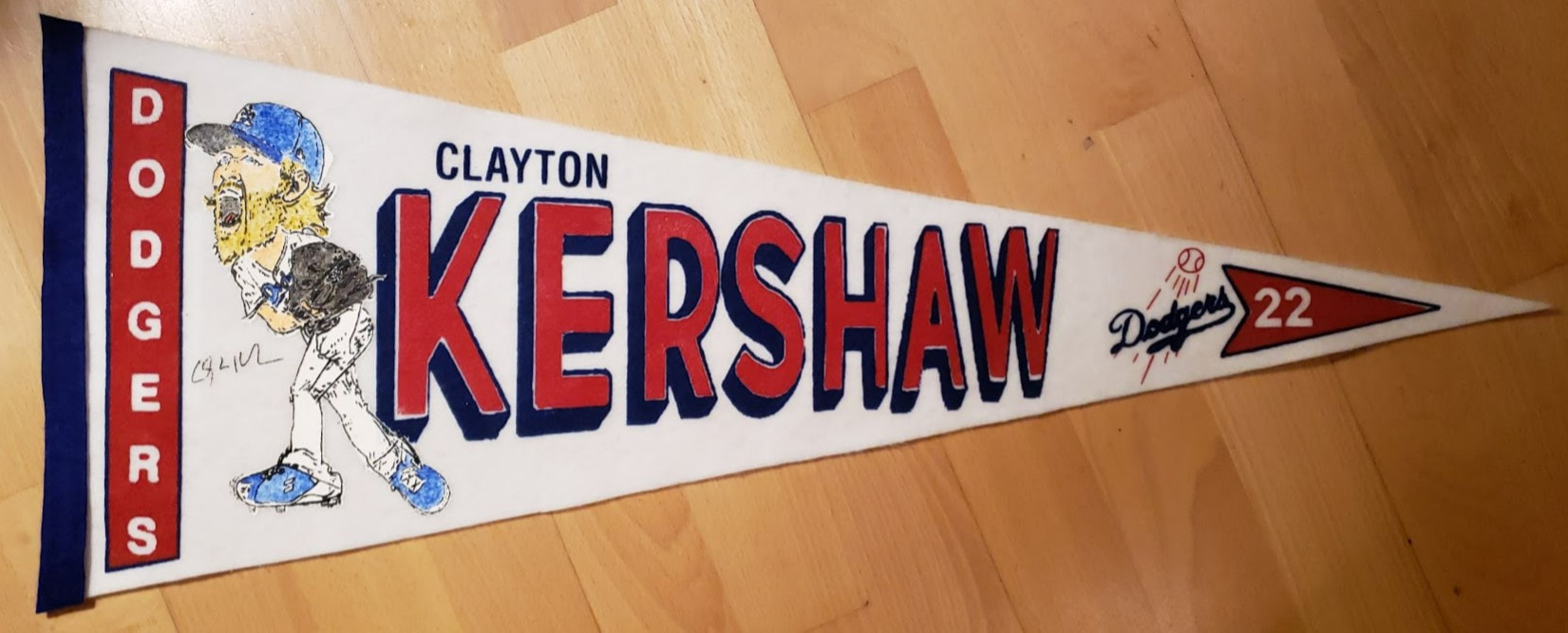
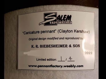
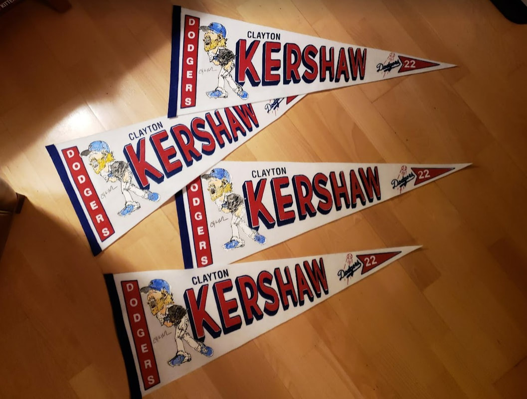
| It's been a few decades since anyone made a good caricature pennant. And since the 1980s are cool again, I figured: why not re-introduce the caricature pennant to a new generation of fans? And, what better contemporary player to commemorate than three time Cy Young winner and 2020 World Series champion Clayton Kershaw, right? Look, if you're going to hang a pennant on your wall depicting a single player, you better have a personal connection to that player. That's even more true if you're going to make the pennant yourself, from scratch. For me, it was no a brainer. Kershaw's been one of the best players of my generation; and throughout his career, he's been a role model both on and off the field. So, to commemorate the south paw's many achievements in Dodger blue, I decided he needed to be immortalized on a caricature pennant. And because Salem Screen Printers is long gone, I would happily make this one myself. | 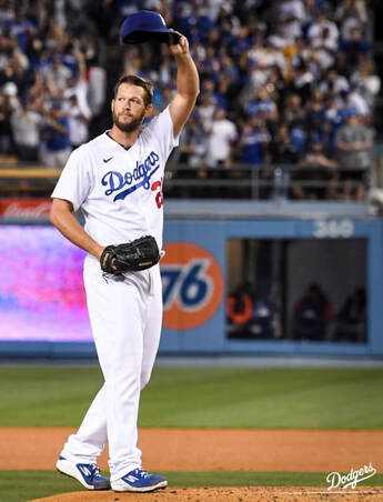 Above: Clayton Kershaw tips his cap to the Dodger Stadium crowd on April 22, 2022 after becoming the club's all time strikeout leader. |
The result
| I based my design of course on Salem's 1989 caricature pennant for Orel Hershiser, yet another Dodger pitcher with a Cy Young pedigree. And as much as I want to tell you I drew Kershaw in caricature myself ... I could not. Thankfully, the internet is full of great artists and their artwork; and there I found an appropriate illustration of Mr. Kershaw that would translate well during the screen printing process. | 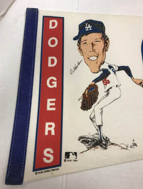 Above: Salem's 1989 caricature pennant for the reigning National League Cy Young winner, Orel Hershiser, served as inspiration for my project. |
Speaking of screen printing, this was one of my most challenging pennant projects to date. Each pennant required four separate color applications--red, blue, white, and black--all carefully applied via screen, one atop the next. Then, when dry, I hand painted the caricature using water colors.
When complete, it felt like 1989 all over again!
 |  |
Interested in one?
Make me an offer, and it's yours. These babies need a good home. Just send me a message via the "GET IN TOUCH" tab, and we'll go from there.
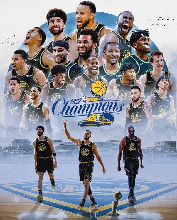
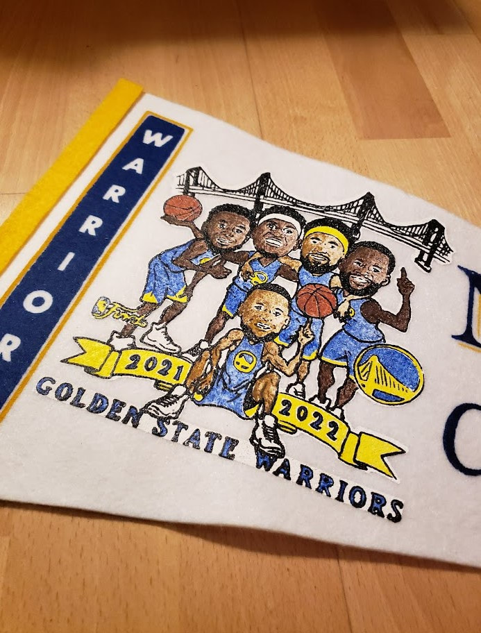
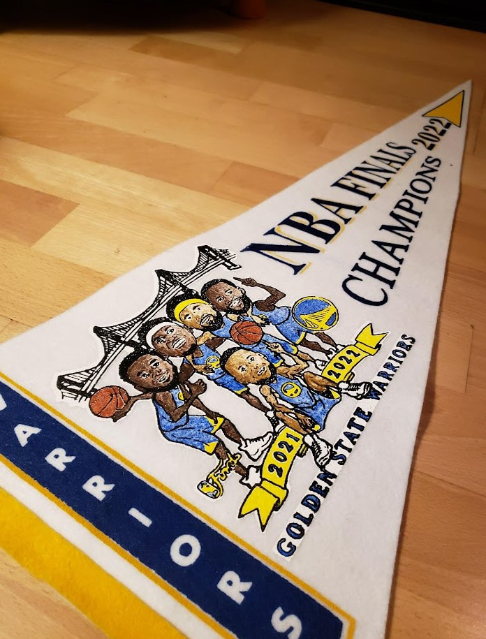
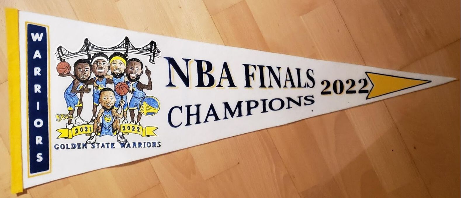
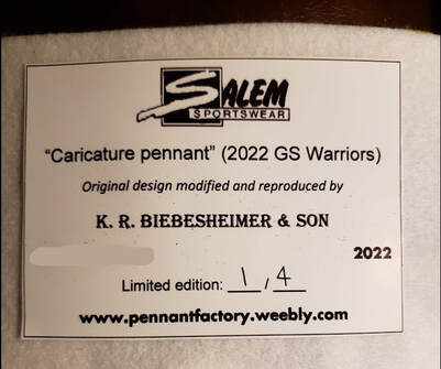
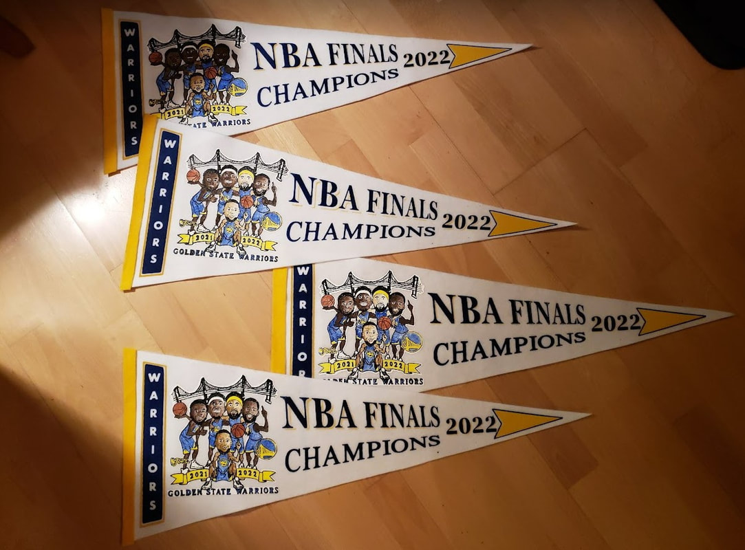
For another example of a Salem-inspired caricature pennant by me commemorating the 2022 Golden State Warriors, click here.
♦♦
The style
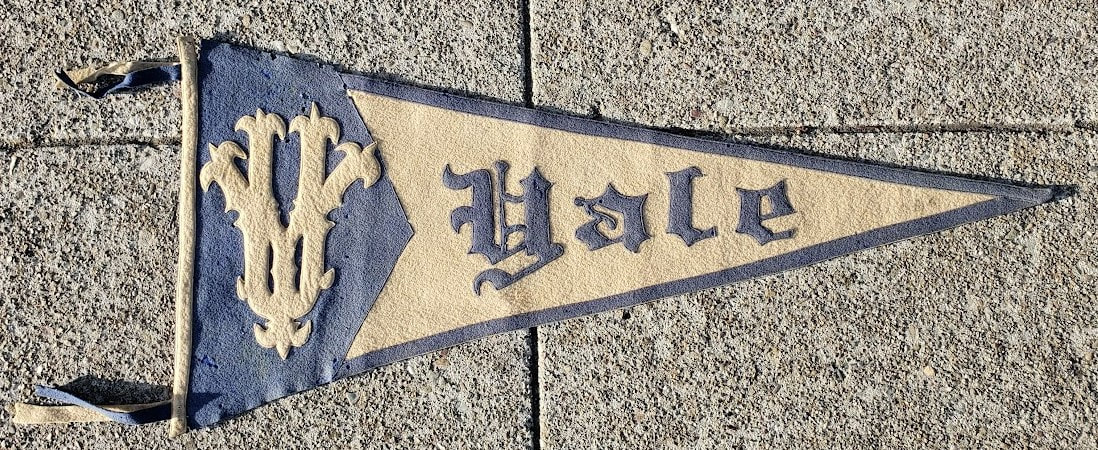
Monogram pennants were quite popular around the 1910s. At that time, only a select few pennant makers were able to screen print their pennants. The majority that lacked access to this novel production method were forced to make their pennants the traditional way: entirely from felt. Among the many sewed letter pennants these makers produced, the Monogram pennant was quite popular.
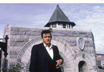 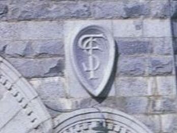 Above: Johnny Cash poses outside California's Folsom Prison in 1968, the day he recorded, "At Folsom Prison." Built in the 19th century, the prison's famous east gate is adorned with decorative masonry, complete with a four-letter monogram: C.S.P.F. (California State Prison Folsom). | In fact, monograms, in general, were very much en vogue at the turn of the century. Indeed, back then many companies, institutions, and individuals of the day displayed their names via monograms. Due to the space constraints on your typical felt pennant, abbreviating a lengthy school name with the aid of a monogram made perfect sense. Monograms haven't completely gone out of fashion. The thing is, today, you mostly see two letter monograms. Three letters, at the most. But 100 years ago, three and even four letter monograms were quite common. Obviously, with every letter you add, the more overlap you get. Consequently, some of these monograms require a bit of interpretation (or uninterrupted focus) before their true initials reveal themselves! And, to make things even more interesting, the letter fonts used to make these monograms were typically among some of the more ornate options available. |
A few weeks ago, I received a package in the mail. Inside, I found this:
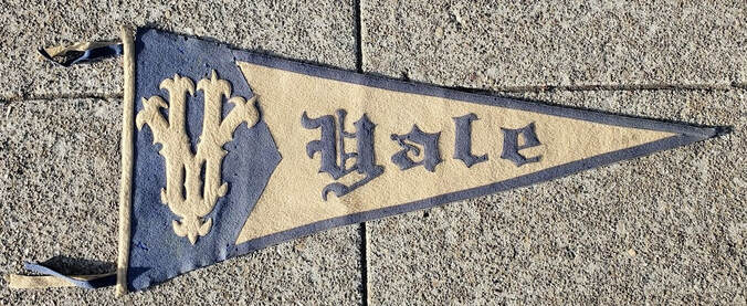
This beautifully made Yale University monogram pennant came to me courtesy of the Tinges Family. According to them, the pennant was purchased in New Haven, CT in the 1920s by their uncle while passing through town. Patricia and Bob: Thank you for sharing this family treasure with me. Your generosity has inspired me to write this post so that others can come to appreciate this forgotten pennant style of yesteryear.
***
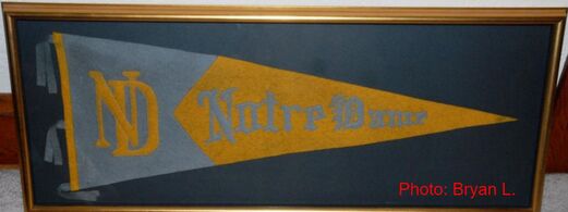
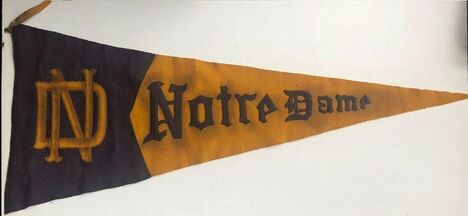
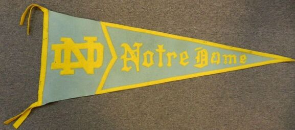
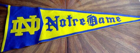
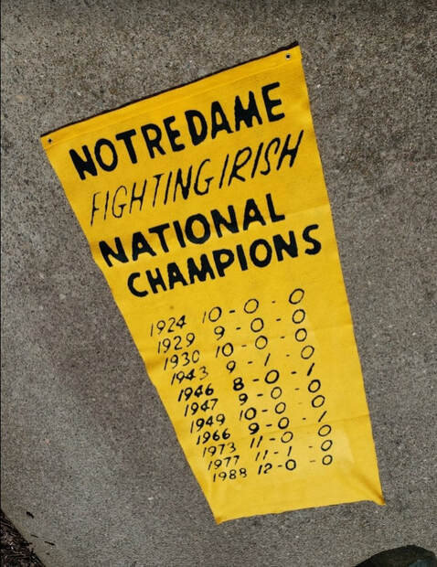
For some time now, I've been wanting to make my own monogram pennant. Like many of my previous projects, I was hoping to make a Notre Dame monogram pennant. For better or worse, most of the monogram pennants from my alma mater made at the turn of the century featured only a two-letter interlocking "ND."
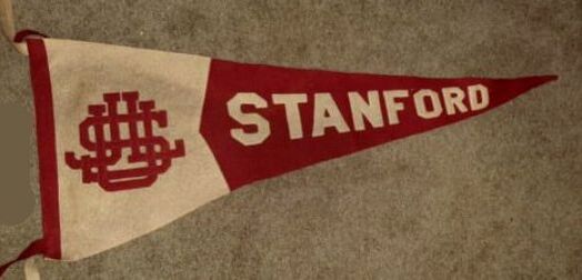
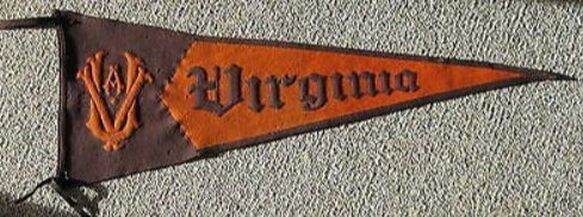
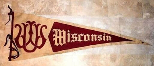
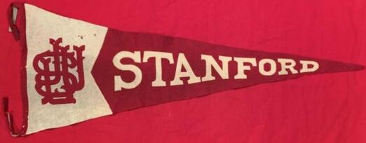
Borrrrrrrring, right? C'mon, Stanford, had those beautifully complex four-letter monograms. I needed a minimum three-letter monogram to really get into this project. So I scoured the internet for something special....
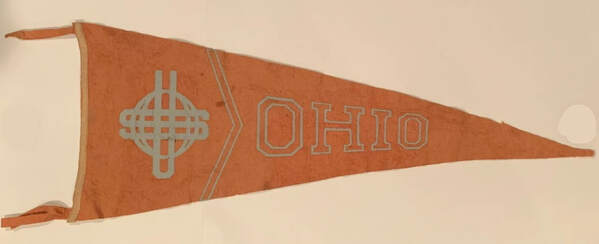
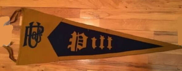
Okay, these weren't bad options:
All of the above are beautiful pennants. No question about it. But, none of these monograms were really anything to write home about. So I kept looking. And, in my online search, I came across an old letter from Knute Rockne, typed on University of Notre Dame letterhead, dated September 27, 1921. And wouldn't you know it? Coach's own letterhead featured this three-letter, U.N.D., monogram:
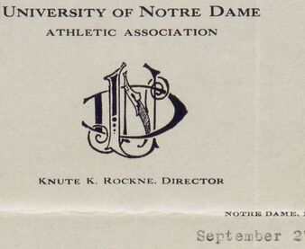
Ah ha! This was what I was in search of. There had to be at least one pennant made featuring this unique three letter monogram, right?
Turns out ... there were two!
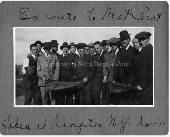
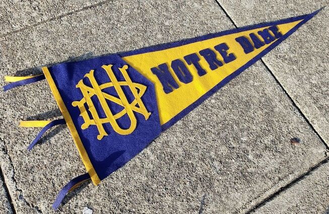
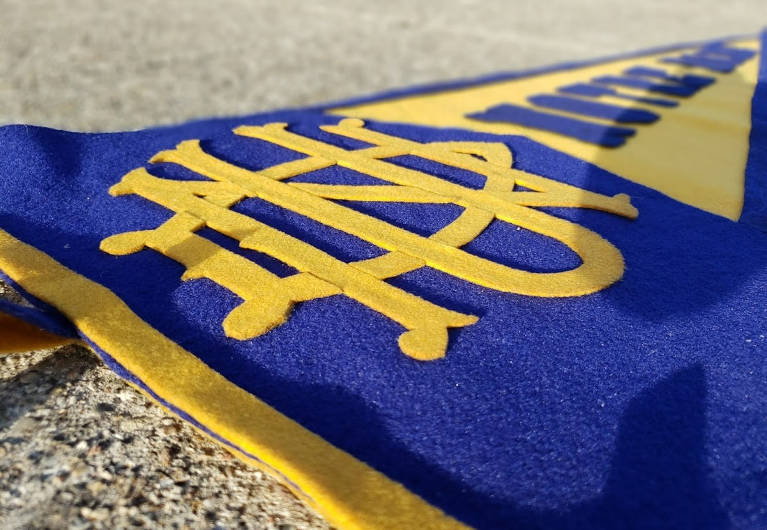
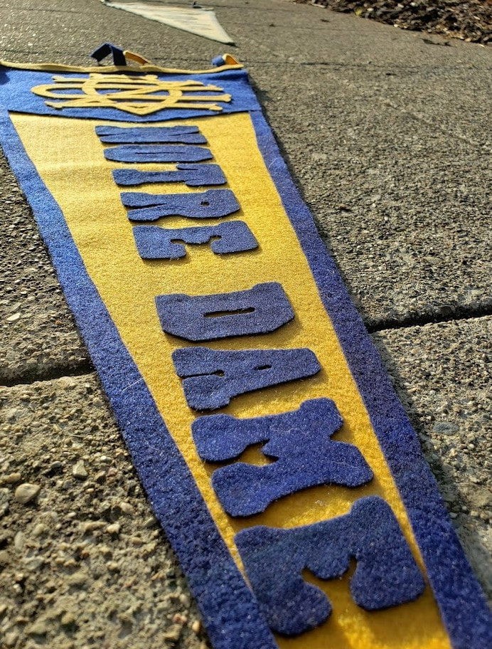
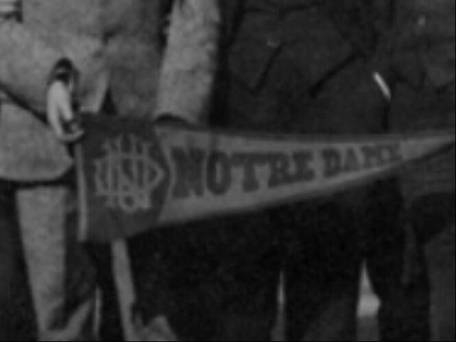 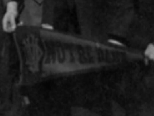 Above: Close-ups of the left (top) and right (bottom) pennants featured in the 1913 photo, referenced earlier. | Is it possible there's no surviving pennants from this production run, today? That's a sad thought. But, could be. Maybe there's one or two left, tucked away in a dusty attic somewhere, just waiting to be discovered? Whatever the answer, I figured, why not recreate this design for myself? From my read of the photo, the original colors utilized were navy (not sky) blue and gold; and the dimensions were a bit oversized, likely about 14" x 36," a popular dimension in the 1910s. Additionally, the monogram featured an ornate letter font, similar to the one seen in the Yale University pennant above; and, no question about it: it featured three interlocking letters: U.N.D. (University of Notre Dame). Finally, it was comprised of two pieces and featured a contrasting border running the length of the tail. With these details in mind, my recreation would attempt to be as faithful to the original as possible. |
The result
It looks (and smells) great. See for yourself.
 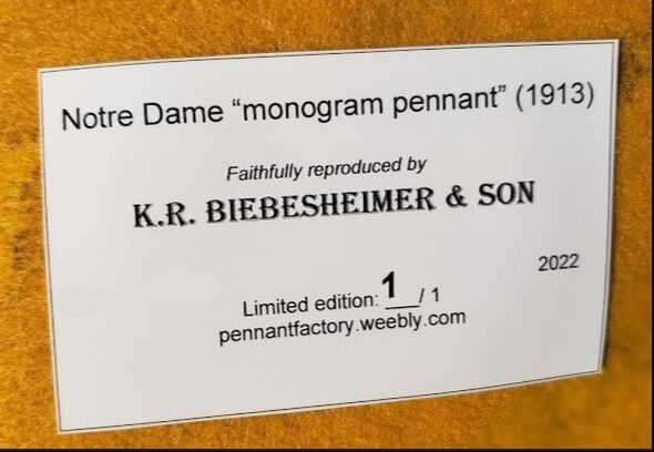 |  |
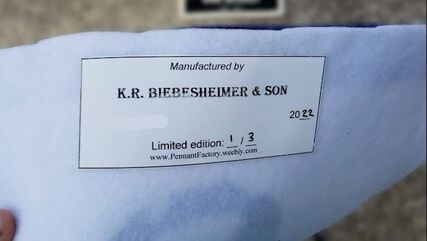
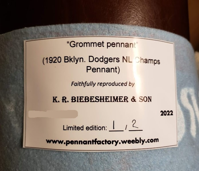
Note: All unquoted material on these pages is © 2022 K.R. Biebesheimer & Son. All rights reserved. Short excerpts may be used after written permission obtained and proper credit is given.
♦♦
Backstory
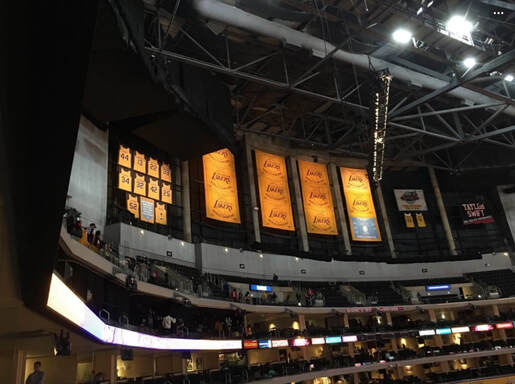
Most likely, this was done to pay homage to the team's prior venue, The Forum, where the banners had been mounted on a dark wall directly behind one of the hoops. When the house lights dimmed, each banner became illuminated by its own spot light. For those that remember The "Fabulous" Forum, it was a pretty cool effect to see those lovely golden banners suddenly pop, right at tip off.
If I'm right, then I appreciate the Staples Center design team for trying to recreate that look in the new arena. Okay, well, the Lakers' current home isn't exactly new: they've called Staples Center home for more than 20 years now. And, yes, it's not even called Staples Center anymore ... but we don't need to get into that. All that's important are the 17 championships and the continuity they help create between the great Laker teams of the past, and the present.
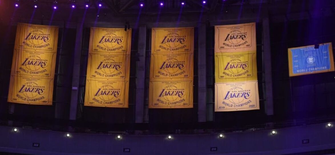
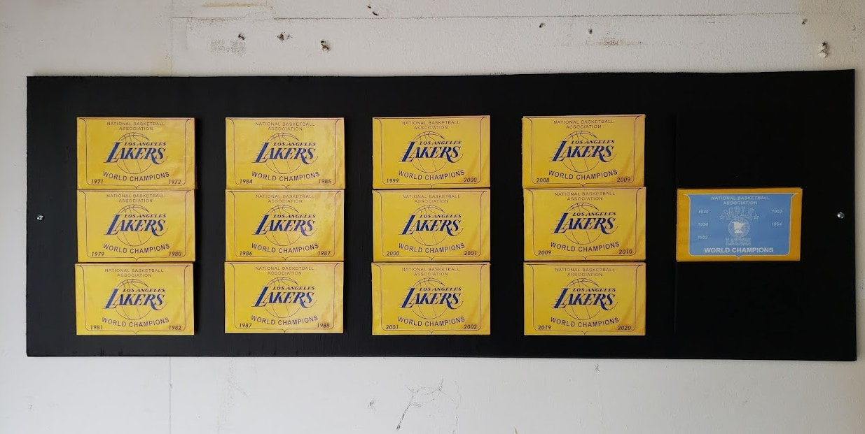
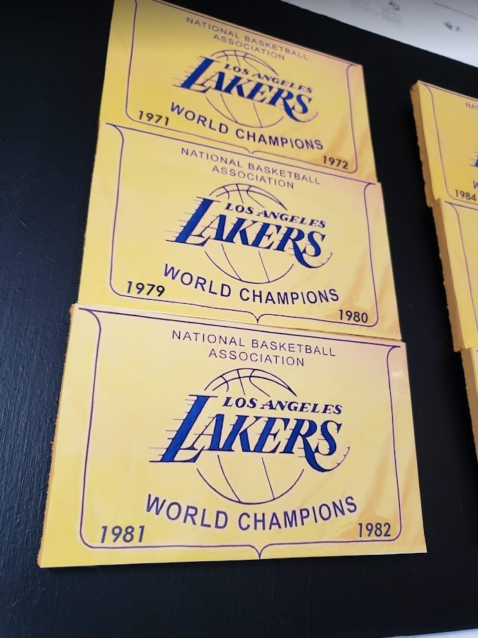
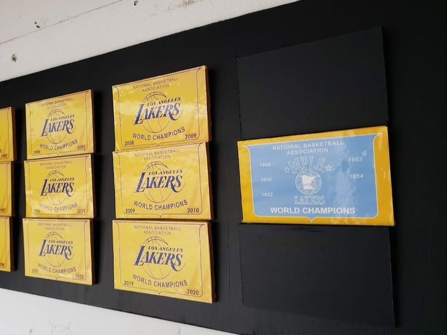
| Let's talk about the banners themselves. Speaking of continuity, there's something to be said about consistency in the look of your championship banners. For most teams, the look of their championship banner changes with the team's logos, colors, and uniforms. Not so much for the Lakers. Since 1972, when they won their first title in Los Angeles, the team's banners have maintained the same simple, classic look: purple logo on gold background framed by a shield; with "NATIONAL BASKETBALL ASSOCIATION" in the header; and "WORLD CHAMPIONS" followed by the years earned in the footer. So all 12 championship banners earned in Los Angeles have the same look. For the five won in Minnesota as the Minneapolis Lakers, a single banner hangs. It's different from the look of the Los Angeles ones, and rightfully so. First, it's blue/gold to reflect the team colors from that era; and it showcases the logo the team used then. But beyond this, it's actually quite similar to the others: same text, letter font, even the same shield. | 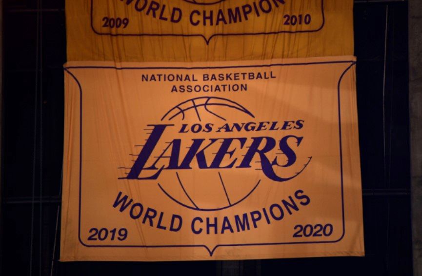 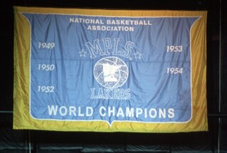 Above: The Lakers' 17 championship titles are celebrated on a total of 13 banners: 12 purple/gold banners for those won in Los Angeles as the Los Angeles Lakers; and one blue/gold banner commemorating the first five titles won by the franchise when playing in Minnesota as the Minneapolis Lakers. |
The result
It also cuts easily using a circular saw. This was important because each of my 13 banners would be cut from the stuff; painted gold; then affixed to the backboard, which was also cut from fiberboard. I painted the backboard black to mimic the darkness of the old Forum and Staples Center while games were in progress.
Finally, each banner was designed on a computer; then printed on decal paper and affixed to to the face of each wooden tile. Once each banner was assembled, I stuck them to the backboard using velcro. Why velcro?
So there'd be room for expansion....
Look, when they win titles 18, 19, etc., you have to assume the present configuration of these banners will change, right?
 |  |
Note: All unquoted material on these pages is © 2022 K.R. Biebesheimer & Son. All rights reserved. Short excerpts may be used after written permission obtained and proper credit is given.
♦♦
Backstory
| If you've ever visited the city of South Bend, IN you no doubt came across one of their many traffic signs. Like any town, they have your standard traffic signage posted throughout the city: speed limit signs, caution signs, do not enter signs, and yes, no parking signs. But, along the city streets neighboring the University of Notre Dame, you'll find a rather unique variation on the typical no parking sign: one that expressly prohibits parking at a given spot during home football games. The reason for the signs is fairly obvious. On game days, the town's population swells by a good 80,000 people. Most of these visitors come by car. Understandably, parking around the stadium becomes limited. And, expensive. For those not wishing to drop $40 on parking in one of the lots controlled by the university, the residential neighborhoods across the street from campus make for an enticing option. Why not? The price is right ... right? Wrong. For the past several decades, street parking in these neighborhoods on game days has been off limits. Of course, to apprise would-be parkers of this prohibition, proper signage became necessary. | 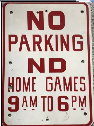 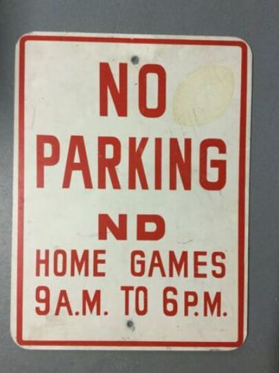 Above: Here's two original signs that recently appeared for sale on eBay. The top reportedly measured 21.5" x 15.5" in size; the bottom measured 24" x 18." |
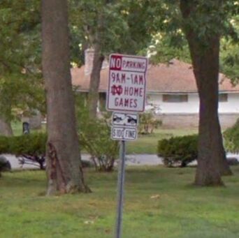 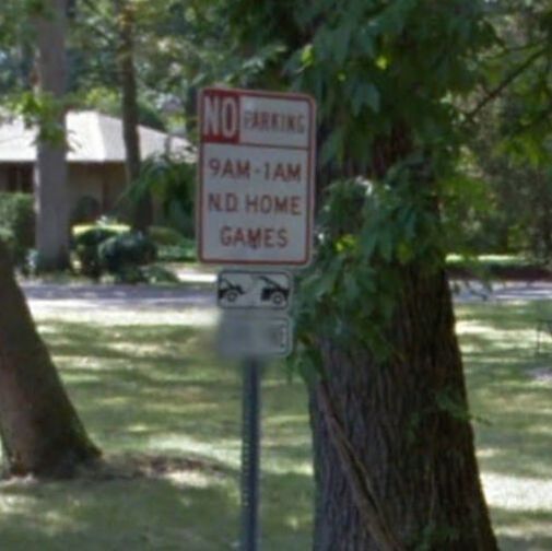 Above: Here's a pair of contemporary no parking signs posted beyond the campus. Today's signs reflect a longer restriction (16 hours), they're a bit smaller, and they identify the university by either its initials or its signature Notre Dame Monogram. | Honestly, I'm not real clear when these signs first hit the streets of South Bend. The homes immediately surrounding the stadium were constructed in the 1950s and 60s. I therefore suspect the first generation signage was posted more than 50 years ago, but they could be older. Moreover, note this first generation of signage prohibited game day parking from only 9 a.m to 6 p.m. Today, the prohibition runs through 1 a.m. the following morning. Finally, these first signs were much bigger. One sold recently on eBay measuring 21.5" x 15.5". Another measured 24" x 18". Today's signs are a bit smaller at 18" x 12", which makes them consistent with other variations of the no parking sign you will find elsewhere. But the best part about these signs was that some feature the Notre Dame interlocking "N.D." monogram on them. It's not often your local public works department cranks out a traffic sign with a trademarked logo on it; but, that's just what the city did. Unfortunately, this also made the signs a tempting target for vandals looking to swipe them as souvenirs. As these signs have disappeared, the city has replaced them with a slightly less appealing "N.D." They're still cool. But, not as cool as the ones featuring the monogram. |
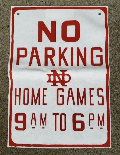
So I figured, why not screen print my own sign?
The result
The result was a happy blend of the old with the new.
And, I didn't have to go to jail to get one!
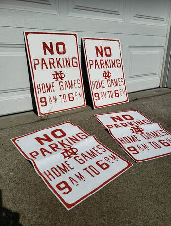 |  |
Interested in one?
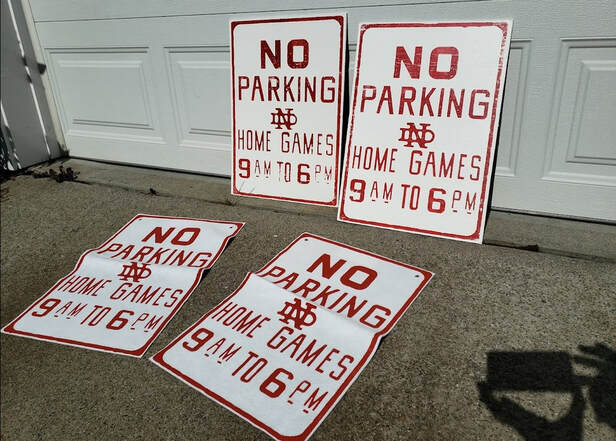
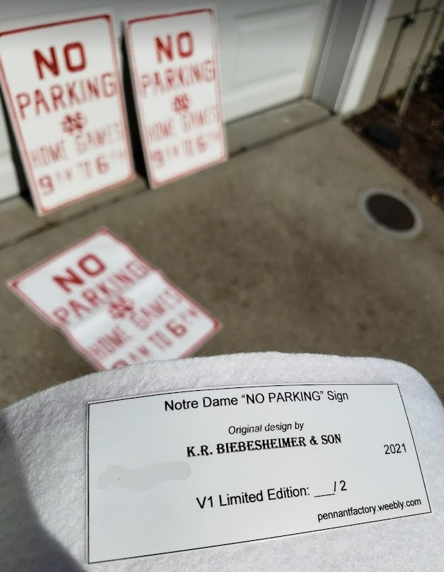
I made two versions. Version #1 (front row) was screen printed on to a felt substrate and features a pair of metal grommets to help hang them . Version #2 (back row) was screened on a wooden substrate; and the paint was distressed to make them look truly vintage.
If you might want to purchase either version, message me via the "GET IN TOUCH" tab.
♦♦
Backstory
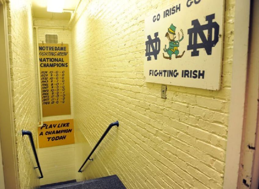
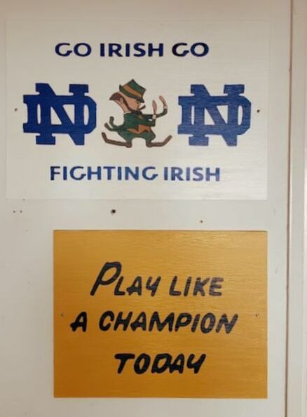
Notre Dame Stadium features three very famous signs. One of them is quite famous. The other two are more known for their close association with the first. This trifecta of signage I'm referring to exists in the stairwell that leads from the locker room to the playing field. And the star, without question, reads simply, "PLAY LIKE A CHAMPION TODAY."
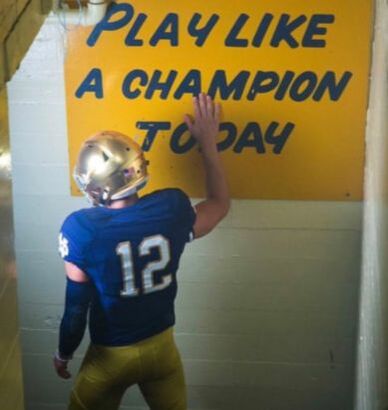 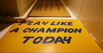 Above/top: Quarterback Ian Book Slaps the P.L.A.C.T. sign en route to the playing field. Above/bottom: Hand painted on wood, Laurie Wenger's contemporary version of the P.L.A.C.T. sign, which measure 3' x 4', has remained a constant at Notre Dame Stadium since 1986. | If you've ever watched a Notre Dame home football game on NBC, you've undoubtedly seen it before. According to tradition, players will slap the sign for good luck as they head to the field. When they do, there's always a camera rolling, broadcasting the image for NBC's viewers at home. You might suspect the "PLAY LIKE A CHAMPION TODAY," or P.L.A.C.T. sign for short, has been around since the days of Knute Rockne; but, not quite. Not this sign, anyway. This sign actually dates to 1986. The story goes: Head Coach Lou Holtz came across an old photo depicting a similar sign in a book on Notre Dame history; and he decided he had to have one. So his coaching staff turned to university sign shop employee Laurie Wenger for her help, and the sign painter turned graphic artist delivered this masterpiece a few days later. It's been in its current location ever since. So what happened to the original P.L.A.C.T. sign from long ago? Nobody knows. That sign was removed from the stadium decades ago; and nobody's seen any pictures of it--other than Lou Holtz, who recently acquired the rights to the P.L.A.C.T. slogan itself. |
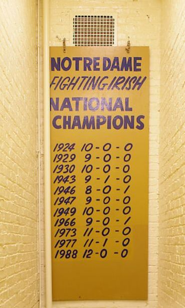
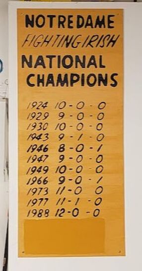
Almost certainly, this sign pre-dates Wenger's P.L.A.C.T. sign. In fact, it looks to me that she modeled her sign on this sign's look. Both signs are made of wood; both signs were painted in the same shade of gold; and both featured hand painted navy blue lettering. Since the two signs were placed together, Wenger's intent was likely that her sign complement what was already there.
Moreover, if you look closely at the championships listed, it seems the sign was likely created shortly after the 1966 season. Look carefully: the entries for '73, '77, and '88 all appear to have been added. Perhaps this sign was commissioned by Coach Ara Parseghian, sometime after winning the school's eighth title?
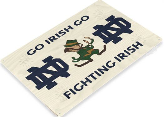
Unlike the previous two signs, this sign hangs directly outside the locker room, at the top of the stairwell. Additionally, it looks nothing like the others. This one's white; and its blue lettering doesn't match the scripts seen on the other two.
But if you want to purchase your own P.L.A.C.T. sign and hang it above your basement stairs, get ready to pay the slogan's owners, Play Like A Champion, LLC (and Lou Holtz) some extra dough. And as to the "NATIONAL CHAMPIONS" and "GO IRISH GO" signs, good luck. Reproductions of these signs aren't as commercially available.
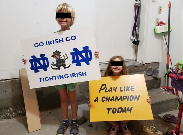
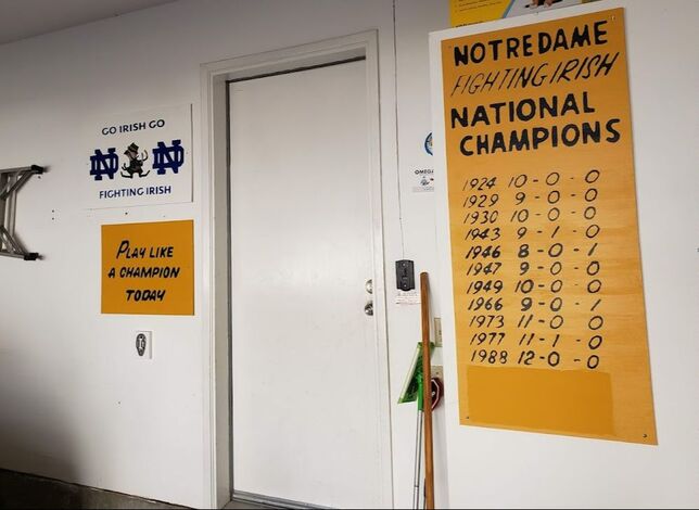
Thankfully, these signs were all made on wood. So, I decided to put my screen printing skills to work and reproduce them myself on a wood substrate, and thereby re-create my own stadium stairwell experience--in my garage.
The result
In conclusion, screen printing on wood: no problem. Maybe even easier than on felt. See for yourself....
 |  |
Interested in one?
***
For more information on the history of the P.L.A.C.T. sign, and Laurie Wenger's role in its creation, check out this ESPN.com article.
Note: All unquoted material on these pages is © 2021 K.R. Biebesheimer & Son. All rights reserved. Short excerpts may be used after written permission obtained and proper credit is given.
♦♦
The concept
If we're being completely honest here, trophy banners were a bit mean spirited. It's one thing thing to commemorate your team's own accomplishments--nothing at all wrong with that; but, celebrating the defeat of another team? That's a bit different. In my view, the trophy banner was really about stick'n it to your rival, plain and simple.
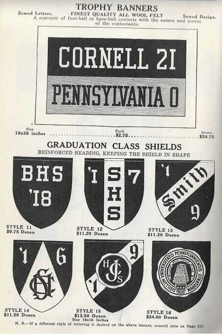 Above: This ca. 1923 excerpt from Annin & Co.'s annual sales catalogue showcases their rendition of the trophy banner. Price? $2.75 each; or $24.75 for a dozen. | Okay, you get the concept. List two team names, along with the final score, then let the gloating begin. Trophy banners were much more common in the early part of the 20th century. Typically, they involved Ivy League football matchups. The best ones seemed to feature a really lopsided final score! After all, these were about bragging rights; and nothing helps you talk smack against your rival like a crushing defeat. Early trophy banners were usually pretty basic. Most featured sewed lettering. The layout often resembled that of a scoreboard. For this reason, rectangular banners were quite popular. Of course, by the 1920s, with the advent of screen printing, and the rising popularity of the pennant, trophy pennants supplanted the trophy banner as the preferred medium for bragging rights. |
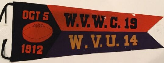
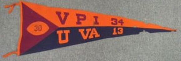
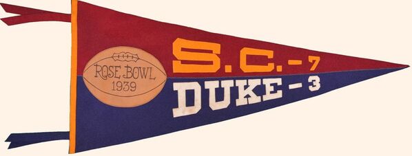
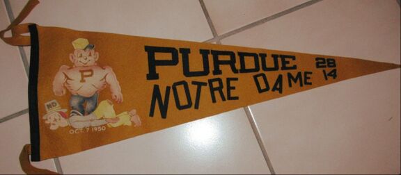
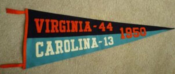
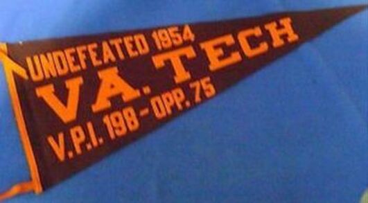
As with trophy banners, manufacturers often made their trophy pennants from two pieces of felt--ostensibly, to represent the primary colors of each team to have participated in the contest. Additionally, these products often included a date; something that makes them especially collectible among collectors today.
If you want a vintage trophy banner or pennant from yesteryear, expect to cough up some big bucks. Especially if the item is really old and/or featured two prominent teams. For the right team/game, I might be willing to spend the money; but, unfortunately, I'm unaware of any cool trophy banners/pennants made for any of my teams--well, none that my team came out on top of, that is! And as cool as I think these products are, I'm not about to drop a boat load of cash on a banner celebrating a game I couldn't care less about.
So, I decided to make my own trophy banner commemorating a contemporary rivalry game I was emotionally invested in.
The design
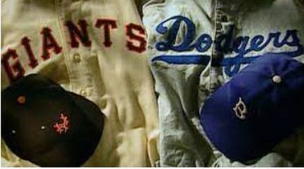
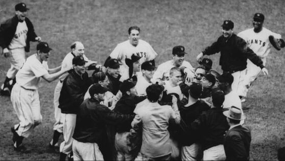
That's the version Giant fans like to share. And for several decades, that story was accepted by just about everyone--even Dodger fans.
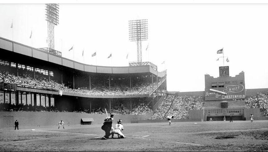 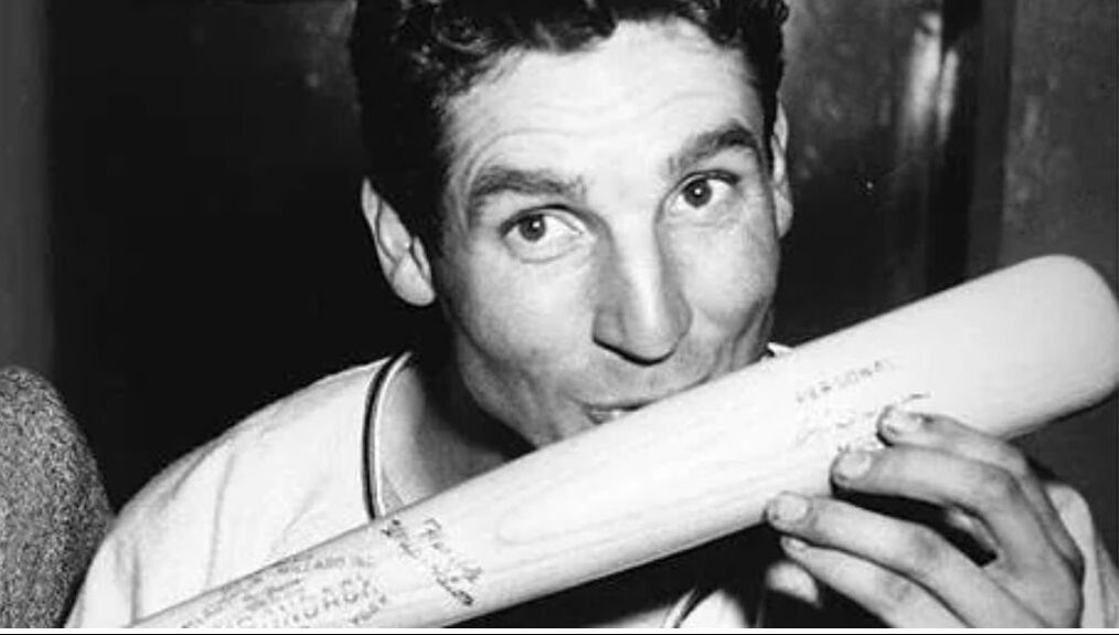 Above/top: Game #2 at the Polo Grounds. The Giants' clubhouse windows can be seen beneath the Chesterfield sign in deep center field. Behind those windows was their secret weapon. Above/bottom: Thomson poses with his lucky bat following their game #3 win. Of course, we now know: there was more than luck at play. | We now that's not the whole story. They were, of course, cheating. According to author Josh Praeger's exhaustive research, a military grade telescope had been perched in the home team's clubhouse above center field enabling the Giants to steal the visiting catcher's signs. An electrical relay system allowed the clubhouse spy to signal the bullpen with the next pitch; there, the bullpen coach would relay this next pitch to the batter, seconds before the pitch arrived. In this way, Giant hitters knew what pitch was coming. That's how the Giants won the pennant. (For more details on the scheme itself, see this WaPo article.) |
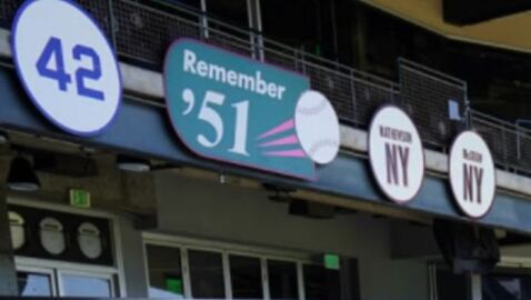
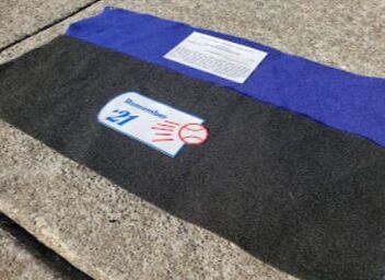
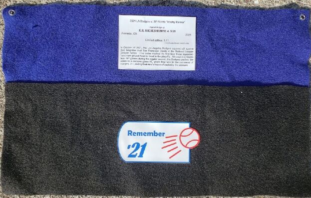
I mean, nevermind the Giants went on to lose to the Yankees in the ensuing World Series, right? But, since the Giants couldn't honor the '51 team as World Champs, they had to settle for a lame "Remember '51" sign, I suppose....
Everytime--and I do mean everytime--I see that stupid sign, it pisses me off. It is essentially a "spite sign," intended to stick it to Dodger fans. The only thing it's missing is the final score!
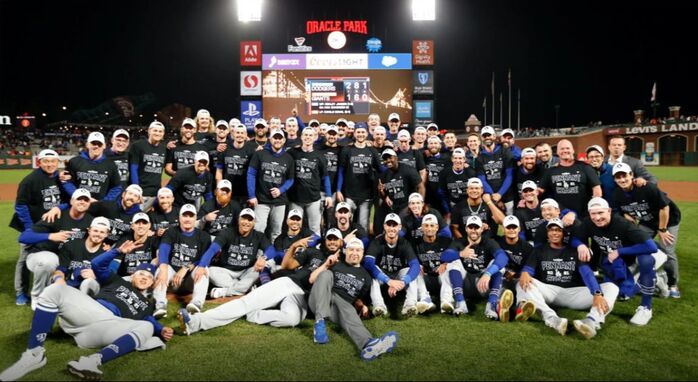
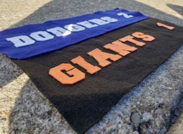
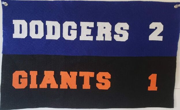
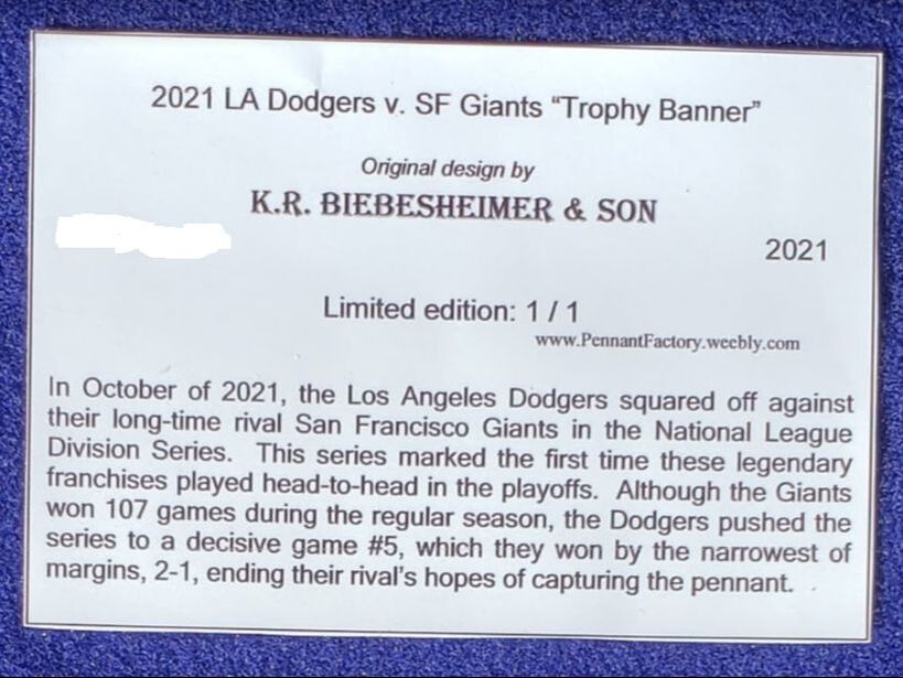
But, what goes around, comes around. In 2021, it was the Dodgers sticking it to the Giants. And, not unlike the 1951 contest, the 2021 NLDS ended with a little controversy of its own, thanks to a favorable call on what appeared to be a checked swing. For Dodger fans, it was the perfect way to eliminate their rivals. Final score: Dodgers 2, Giants 1. The Dodgers had taken the series. And while the Dodgers weren't able to repeat as world champions, we'll always "Remember '21." And thanks to my trophy banner, we'll never forget which team came out on top!
The result
I can't tell you how cathartic this project was to make....
 |  |
 |  |
Note: All unquoted material on these pages is © 2021 K.R. Biebesheimer & Son. All rights reserved. Short excerpts may be used after written permission obtained and proper credit is given.
♦♦
Author
In 2018 I started a separate website called Pennant Fever dedicated to 20th century felt novelty manufacturers. It focuses on these companies' history, products, etc. Eventually, my interest in these businesses inspired me to start making my own pennants. THIS site you're currently viewing, Pennant Factory, is where I'll showcase some of the felt projects I've taken on. Most are reproductions of real pennants once for sale to the public. I've done my best to re-create the originals as authentically as possible based upon surviving photos, known dimensions, etc. Others are my original work, intended to look like the styles of yesteryear. Some turned out better than others. See for yourself. Enjoy! -KRB
Projects:
All
1916 NL Champs Pennant
1952 + 1953 NL Champs Banners
1955/2020 WS Champs Banners
1955 WS Champs Pennant
1959 NL Champs Pennant
1963/2020 WS Champs Pennant
1965/2020 WS Champs Pennant
2020 WS Champs Burgee
"3-D Pennant" (ca. 1950s)
"B.B.C. Series" Pennant (ca. 1910)
Bklyn. Robins Pennant (ca. 1917)
"Burnt Leather Seal" (ca. 1940s) - Collegiate Mfg. Co.
"Caricature Pennant" - Clayton Kershaw
"Caricature Pennant" - GS Warriors
"Date Pennant" (ca. 1960s)
Dodger Stadium Scoreboard (1988)
Early 1910s Football Pennants - Reproduction Co.
"Grommet Pennant" - 1920 NL Champs Pennant
GW Forum Scoreboard (1998) - LA Kings
Jackie Robinson Pennant (1947)
Keezer "Emblem Pennant" (ca. 1950s)
"Kicked Football Series" Pennant (ca. 1940s) - Epstein Novelty Co.
LA Dodgers V. SF Giants "1st. GAME" Pennant (1958)
"Mascot Banner" - Chicago Pennant Co.
"Mascot Banner" - Collegiate Mfg. Co.
"Mascot Banner" (II) - Chicago Pennant Co.
"Monogram Pennant" (ca. 1910s)
ND "NO PARKING" Sign
ND Stadium Scoreboard (1988)
ND Stadium Signage
Notre Dame Banner (1931)
Notre Dame Pennant (1925)
Notre Dame Pennant (ca. 1965)
Oakland Raiders (AFL) Pennant (1960) - ADFLAG
Oakland Raiders (AFL) Pennant (ca. 1960) - Trench
Phila. Athletics Pennant (ca. 1910)
"Photo Pennant" (ca. 1960s)
Schaefer Promo Sign (1955)
Staples Ctr. Banners - Lakers
Staples Ctr. Banners - LA Kings
"Trophy Banner" (ca. 1920)
Vin Scully Tribute Banner (2022)
"WELCOME....' Banner" - Carly Bros.
Archives
February 2024
November 2023
September 2023
July 2023
May 2023
February 2023
January 2023
December 2022
September 2022
August 2022
July 2022
April 2022
February 2022
December 2021
October 2021
August 2021
July 2021
May 2021
February 2021
January 2021
December 2020
November 2020
August 2020
March 2020
February 2020
December 2019
November 2019
August 2019
May 2019
January 2019
December 2018
November 2018
 RSS Feed
