 The jobBefore they were known as "The Silver and Black," the Raiders were, in fact, gold and black. And, for like eight days, they were officially called the Oakland Señors.... Yup. Those were the early days of the fledgling American Football League (AFL), an upstart pro football league trying to compete with the well established National Football League (NFL). The story goes: in 1959, when the AFL was in its infancy, the ownership group representing the AFL franchise headed for Minneapolis accepted a last minute invitation to join the NFL. That left the AFL scrambling for a replacement. Short on time, they looked west. And they saw Oakland, California ... a market that already had one NFL franchise in it playing across the bay; a city that had never supported a big league sports team in its history; and most importantly, a town with no stadium suitable for professional football.
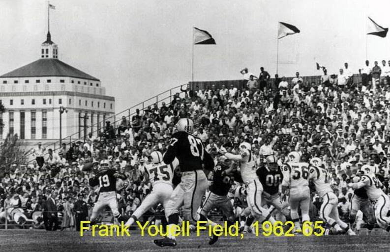
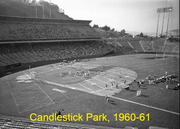
Kind of makes you wonder whether it was all worth it. To make up for the past two decades of sub-par Raider football, we have always turned to our rich history. (Otherwise we'd be scratching our heads over all the missteps, from Jamarcus Russell to Antonio Brown; and don't forget Lane Kiffin.) And no doubt about it: throughout the 1960s, 70s, 80s, and 90s the Raiders did manufacture some glorious moments, including three Superbowl wins. But our story begins much like it ends: with lousy football. If you think the Raiders of today stink; take a look at their first three years in the AFL. Before Al Davis joined the team, the 1960-62 Raiders were a complete mess. That '60 team went 6-8; but the '61 team went 2-12 and the '62 squad went 1-13, with a 19 (19!) game losing streak spanning these last two seasons. These early teams' on-field performances were only half the story. The other half, of course, concerned their ballpark. When the University of California declined to let the Raiders play home games in nearby Memorial Stadium, ownership went scrambling for a place to call home. Unfortunately for them, their only available options sat in San Francisco.
So the Oakland Raiders never played a game in Oakland until their third year in the AFL. Honestly, it's nothing short of a miracle that the Raiders franchise survived those initial years. They lost 19 games in a row. They were nearly homeless. They had trouble hiring their first head coach. If someone told you after the 1962 season ended that this franchise would morph into "The Team of the Decades" or come to embody a "Commitment to Excellence," you'd think they were nuts. So what happened? 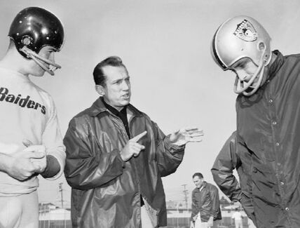 Enter Al Davis. Upon being named Head Coach in 1963, Davis completely upended the Raider organization from top to bottom. Sure, he was the best at spotting talent; and he immediately went on to build some competitive teams. But, he implemented other changes that were instrumental in building the Raider brand into what it is today. Chief among them: the team colors and uniforms.
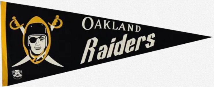
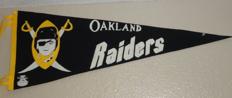
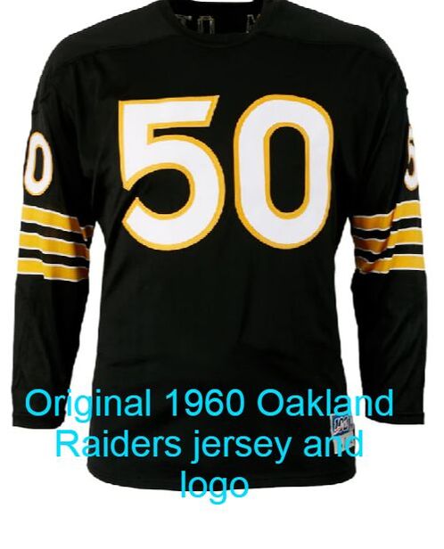
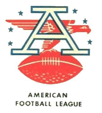
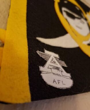
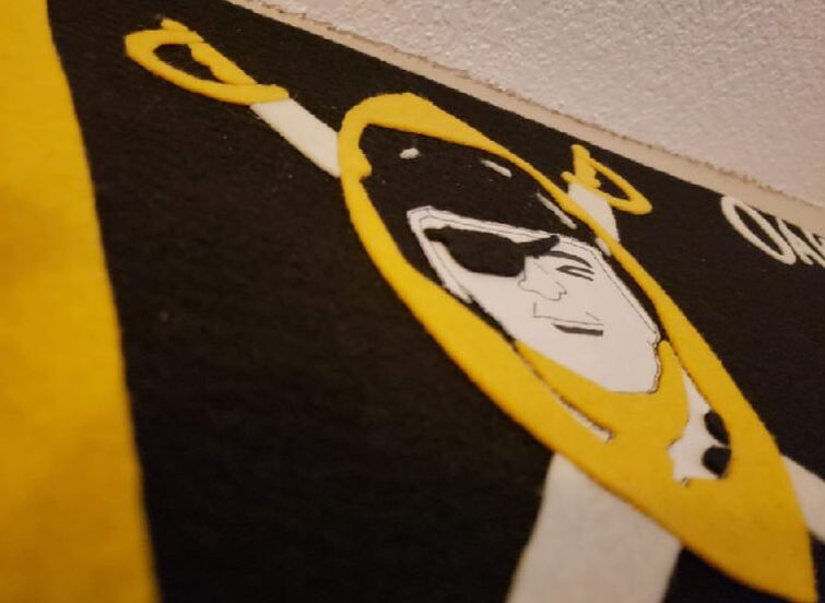
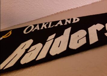
As noted above, in 1963 Al Davis altered the black-and-gold color scheme for the iconic silver-and-black that we all identify with the Raiders' uniform today. Allegedly, Mr. Davis felt black uniforms made his players appear bigger and more intimidating to opponents. But he wisely kept the logo mostly in tact, swapping only the gold football backdrop for a silver, then black shield. Today that logo endures as one of the most distinctive sports logos ever created. Every great team, like every great company, band, artist, etc. has a beginning. Sometimes that start is a humble one. The Raiders were no exception. Nevertheless the Raiders defied all odds and somehow evolved into one of the most distinctive sports brands ever created. And while I truly wish them good luck in Las Vegas, their roots will always be in Oakland where that identity first took shape. 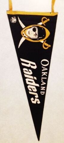 My favorite pennants tell you a story. This one conveys the genesis of the "Men in Black." Take one look at it and it's obvious it was made during those initial three years in the AFL, i.e., before Al Davis came to town and rescued the fledgling franchise (and league) from certain failure. The kid that took this souvenir home likely bought it at Candlestick; and the parent that likely paid for it had to be thinking, "We won't return here anytime soon" after spending a chilly afternoon watching the Raiders lose to the Oilers. With that setting in mind, it's no wonder not many AFL pennants like this survived the past 60 years. Like most AFL pennants from the early 1960s, this one's extremely rare; and because the Raider Nation has such a deep appreciation of the team's history, it's always in high demand when it comes up for sale. And because I'm as frugal as the Davis family when it comes to buying pennants, the only way I'll ever get my hands on one is to make it myself. The designLike many great pennants from the 1960s, this original pennant was made by Trench Mfg. Co. of Buffalo, New York. Both the logo and lettering were screen printed in two colors: gold and white, with the black backfelt serving as a third color. It's full size and it features two pairs of gold tassels. No question about it: the biggest challenge for me came in recreating the logo using felt. It is very detailed in places; and, to complicate things, it's made from three colors. It's also mostly symmetrical. That means, when drawing it from free hand, you have to take measures to ensure you maintain the logo's symmetry throughout the process. If one sword is slightly longer than its mate, the logo won't look right. 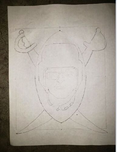 After figuring out the dimensions of the logo I set out to draw it in pencil. For the swords, I drew one on some thick paper; cut it out; then used that cut-out as a stencil to draw the first and second one. This way both swords came out as mirror images of each other. I used this same method for the football and helmet. After drawing in the face, my template was complete. What followed next can best be described as putting a jigsaw puzzle together. Except, before doing so, I had to create the pieces. For everything but the face, I used felt. Each felt piece had to be cut exactly according to my template's specifications. As I've done with previous projects, I photocopied my template; glued the copy to some freezer paper; then ironed the combo to a scrap of either gold or white felt. After cutting each piece out, I assembled my "puzzle" on the black backfelt and--voila!--a faceless raider soon appeared before me. 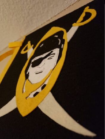 On to the face. Had I the ability to screen print this logo, replicating the detail of the raider's eye, nose, and mouth would have been a lot easier. Unfortunately, I'm not quite ready for that. As I've done with previous projects here on Pennant Factory, I used linen for the raider's face and drew his features in ink. I cut the face out and added it to the other pieces. The "cherry on top" so to speak was the raider's eye patch, which I cut from black felt and glued to the linen face. Many hours later, the logo was complete. I didn't take many pictures of the process as it was coming together; however, the mess on the floor of my garage illustrates the progression of how this logo was constructed: 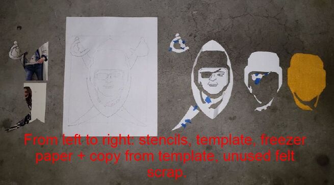 The lettering was fairly straight forward. Trench made post-merger NFL pennants following the 1967 season; and when they made their Oakland Raiders version, they used the exact same lettering. So I just pulled out one of these from my collection and used that as the template for this project. Easy peasy. Last, the AFL logo. This portion of the design is finely detailed, too. To perfectly replicate it would require screen printing, as the individual stars are nearly microscopic. Way beyond my abilities. So I did my best to re-create it on linen using ink.
Finally, I glued the spine and tassels to the pennant and this project was done. The resultThe Raiders are poised to open the 2020 season in a state of the art stadium their fans have waited 60 long years for. I only wish that site were in Oakland. And while the future looks bright for the Raider Nation, their roots will remain in Oakland as long as pennants like this survive to tell that chapter of their story.
  Note: All unquoted material on these pages is © 2020 K.R. Biebesheimer & Son. All rights reserved. Short excerpts may be used after written permission obtained and proper credit is given. ♦♦
3 Comments
|
AuthorIn 2018 I started a separate website called Pennant Fever dedicated to 20th century felt novelty manufacturers. It focuses on these companies' history, products, etc. Eventually, my interest in these businesses inspired me to start making my own pennants. THIS site you're currently viewing, Pennant Factory, is where I'll showcase some of the felt projects I've taken on. Most are reproductions of real pennants once for sale to the public. I've done my best to re-create the originals as authentically as possible based upon surviving photos, known dimensions, etc. Others are my original work, intended to look like the styles of yesteryear. Some turned out better than others. See for yourself. Enjoy! -KRB Projects:
All
Archives
February 2024
|


 RSS Feed
