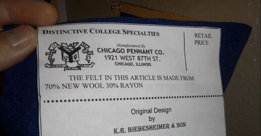
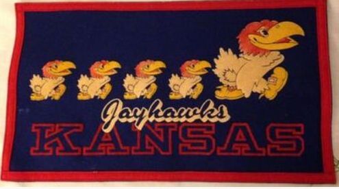
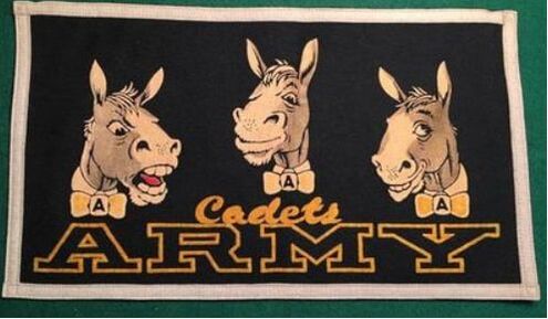
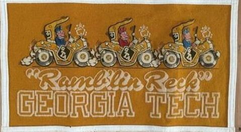
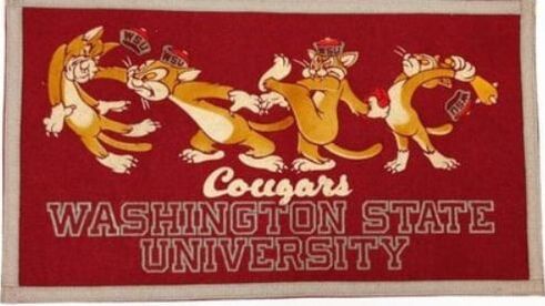
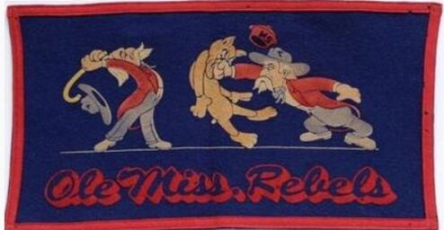
 The designIn the previous century many felt novelty manufacturers offered, in addition to pennants, collegiate banners. In the 1950s, two companies made some of the best ones ever to hit the market. One of these makers was the Chicago Pennant Co. (Chipenco). They call it a "mascot banner". The design was fairly consistent. As the name would suggest, the design centered around an artistic rendering of each school's mascot. The dimensions were on the small size; about 17" x 9". All were rectangular. The graphics and lettering were made of flock, i.e., raised felt. The top 2/3 of the banner often featured colorful artwork; and the bottom 1/3 usually featured text. Sometimes this text merely listed the school's name, typically in a block, 3-D collegiate font. Other versions, however, featured the addition of that school's team name in cursive inscribed above the school name. As was consistently done with all of their products, a sewn Chipenco label appeared on the reverse. Here's a small sampling of the various styles offered: 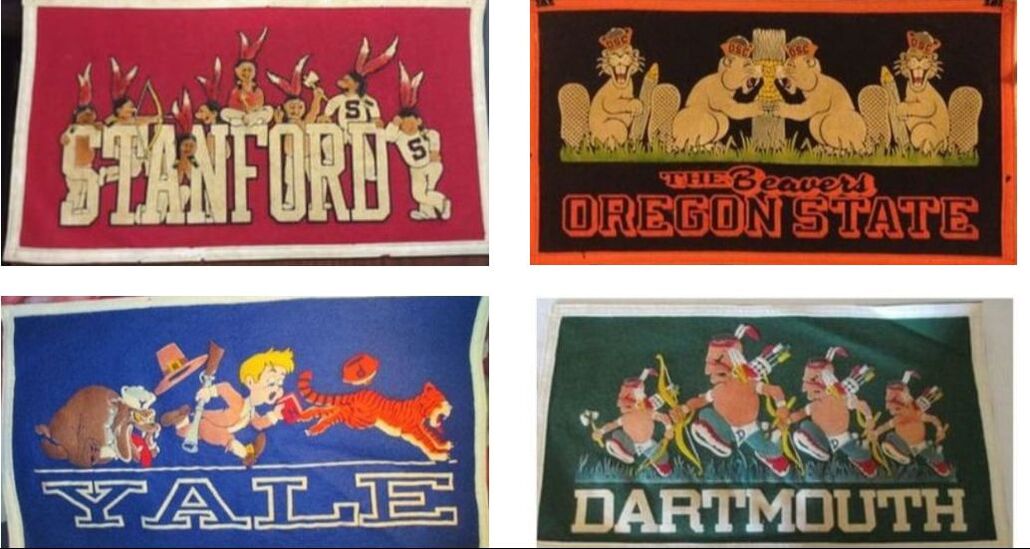 But it was the artwork that made these mascot banners so special. Typical banner designs offered by other makers of the day consisted solely of the school name in sewn letters; and perhaps maybe the addition of a burnt leather seal or monogram. There really wasn't any original artwork to speak of. And nothing about them was intended to be funny or cute.... To be clear: Chipenco did offer these more basic, traditional designs. Here's a glance at a 1930s era catalogue of theirs showcasing some examples of these primitive banners: 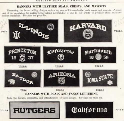 You see what I mean? There's just not too much in the form of original artwork in the above banners. Don't get me wrong: they're still really cool; and the craftsmanship that went into making them was especially noteworthy. But, because they primarily relied on the school names and/or seals--which the felt novelty manufacturer was not responsible for designing--these products were not as ... memorable. At least in my opinion.
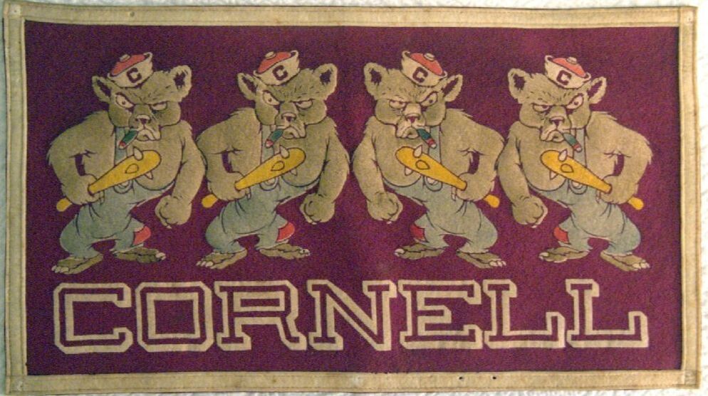
They're amusing, are they not? As you can see this style is completely different from the more traditional ones discussed earlier. Not only do these consist of original artwork; but, they're made differently. By the 1950s, Chipenco was using flocked graphics via their distinctive "Silvet Process" on the majority of their felt novelty products. This medium enabled them to create such rich, colorful graphic illustrations--something that would have been impossible using sewn letters and graphics. I've used the term "original artwork" several times now to describe Chipenco's mascot banners. Some of it indeed was original; however, Chipenco--like many other felt novelty manufacturers of the day--stole some of this material from their competitors; most notably: Collegiate Manufacturing Co. (CMC), the other company responsible for making these mascot-themed collegiate banners in the 1950s. As I've commented on time and again, this was commonplace throughout the industry before the the 1960s because artists never bothered to trademark their graphic designs; and schools let anyone use their names, logos, seals, and insignia. So if you happen to notice a good deal of similarity between Chipenco and CMC's mascot banners, especially when it comes to the mascots themselves--this is why. At any rate, I have always appreciated the style of Chipenco's mascot banners. So I decided to make one myself. The jobAfter looking through a few dozen of these Chipenco mascot banners, I noticed the Notre Dame version was curiously absent. Which made zero sense. Notre Dame was one of Chipenco's biggest markets. They had been making felt novelty products for the university since at least the 1930s. And by the 1950s, Notre Dame had emerged as the premiere college football program in the nation, having won four national titles the previous decade under Head Coach Frank Leahy. So I looked harder. Then I finally found it. And, it looked like this:
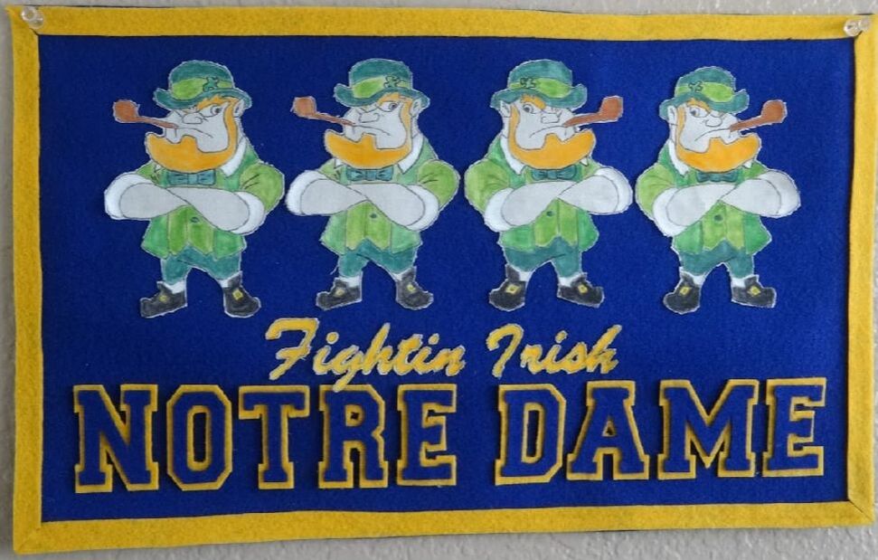
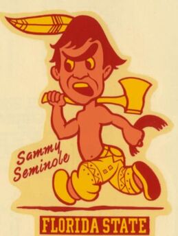
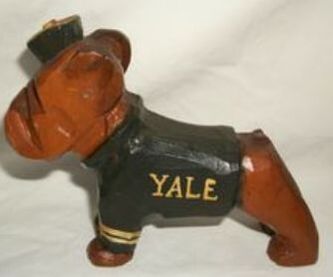
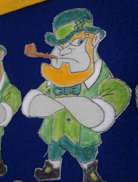
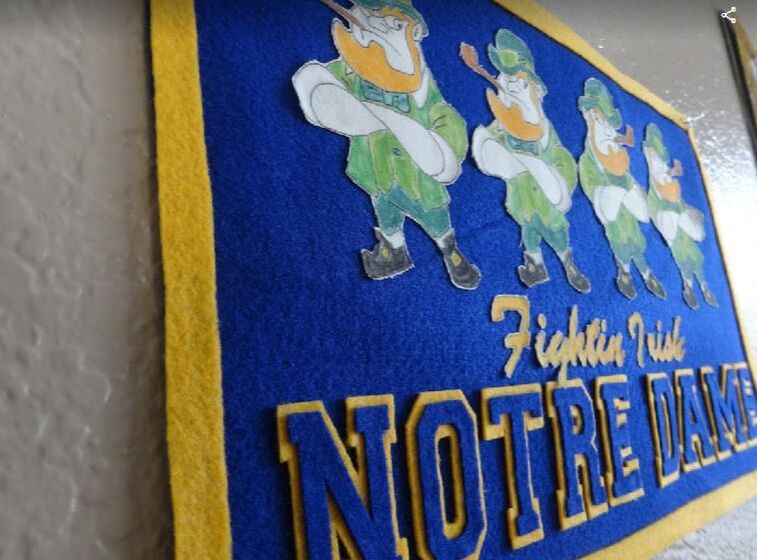
This was it. One image; from one meager listing in the past decade. There simply couldn't have been too many of these made.... I think I know why. I'm not going to say the design is ugly; but, it's nothing to write home about either. Bottom line: there's simply nothing amusing or charming about this artwork like the other mascot banners Chipenco produced for other schools. In fact, it doesn't even attempt to depict Notre Dame's mascot at all. That's the problem. 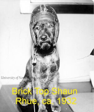 Ever since since the 1920s Notre Dame had used a mascot; but, if you're thinking he was a leprechaun--you're mistaken. According to the university's archives, in 1924 Head Coach Knute Rockne was given an Irish Terrier for use as the school's new mascot. Through the 1960s, several Irish Terriers would serve as the school's official mascot. The most well known of these was "Clashmore Mike". But by the end of the 1960s, the lineage of K-9s ran dry; only to be supplanted by the now famous sideline "Leprechaun" played by a student, still used to this day. It seems to me the art department at Chipenco could have taken note of the above facts. Every other mascot banner of theirs featured some reference to each school's mascot. Not Notre Dame's. Perhaps the Irish Terrier was not nationally recognized as the school's mascot by the 1950s, as other mascot pooches were, such as Yale and its bulldog? In light of the above, I decided I would make a Notre Dame banner in the style of Chipenco's other mascot banners; but mine would feature a leprechaun. Not only is a leprechaun more recognizable with the school today than an Irish Terrier; but, a human leprechaun of some sort has appeared on the sidelines of Notre Dame Stadium since the 1940s, according to the university's archives. Therefore, it's not inconceivable that Chipenco would have used a leprechaun in a Notre Dame mascot banner made in the 1950s. So I looked online for some leprechaun artwork resembling something like the the other mascot depictions Chipenco had created. He had to look somewhat cartoonish. His eyes had to resemble the distinctive non-circular eye sockets exhibited by so many of their other mascot illustrations. And, since leprechauns aren't exactly known for being cute, he had to be the next best thing: angry. I settled on the below image because it checked all the boxes; and, it could be reproduced easily, as I planned to make four of them: 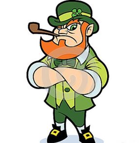 As noted above, Chipenco made several different styles of mascot banners. The style I liked the most featured a grouping of four mascots, with the school name written in block lettering below; and the team name written in cursive above that. I started with my leprechauns. Two would face left; the other two would face right. The key was to make them appear uniform. The slightest variation in one leprechaun to the next would throw all the symmetry off. So I drew him first on paper; then transferred him on to linen by tracing the underlying image atop the linen in black ink. (For the two that would face right, I simply mirror imaged my drawing and transferred that image to the linen.) Next I colored them in using water colors crayons. Again, the key with this step was to make sure that all colors were applied evenly; and uniformly. Ideally, the colors would look like they had been air brushed on. Hence the use of water colors. Unfortunately, the water color crayons were a bit of a mess. After coloring my images in, I gently applied small amounts of water via brush. This smeared the paint around, kind of like traditional water colors; but, the final appearance was not as even as I had hoped for. 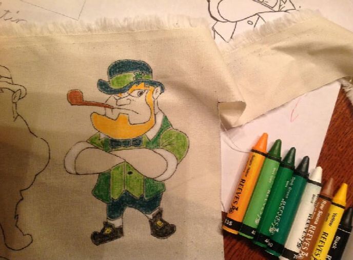 Next came lettering. The block lettering wasn't too difficult; but it was labor intensive. On the original banner, each letter is merely outlined in flock, i.e., the center of each letter is the same color of the backfelt. To mimic this look, you have to cut two of each letter; with one being slightly smaller than the other and the same color as the backfelt; the other being just a bit bigger and in a contrasting color. When placed atop each other, only the outline of the contrasting color shows, thereby matching the look of the original design. Here's what it looked like, up close: 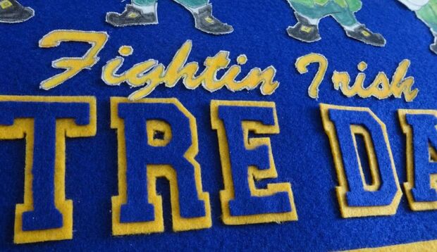 The cursive subscript spelling out "Fightin Irish" created a different set of challenges. I recognized the cursive font Chipenco used as "Brush Script MT". Initially, I tried to reproduce this on gold felt; but, the font was so tiny, it proved too difficult to cut out. As you can see above, I resorted to the same linen my leprechauns came from; which was the right call. Each word was still a challenge to cut out, but they came out looking closer to the real thing, that's for sure. The resultI think this project turned out great. The leprechaun I used closely resembles the way Chipenco's art department might have depicted a leprechaun from Notre Dame in the 1950s--had they bothered to include one on their banner, of course. I did my best to make all four of them identical. Had the water color crayons not been such a bust, I would have achieved this, as the coloring would look more even, more uniform. I don't know that Chipenco's art department would offer me a job, but I think they'd have to admit that my design came out a little more memorable than theirs.
  For the most comprehensive online gallery of collegiate banners, including some featured in this post, visit: vintagecollegebanners.weebly.com . For more information on Notre Dame and its history concerning mascots, see: archives.nd.edu/about/news/index.php/2011/notre-dame-mascots/ For more information on the Chicago Pennant Co. (Chipenco), see: pennantfever.weebly.com/blog/category/chicago-pennant-co . Note: All unquoted material on these pages is © 2019 K.R. Biebesheimer & Son. All rights reserved. Short excerpts may be used after written permission obtained and proper credit is given. ♦♦
0 Comments
|
AuthorIn 2018 I started a separate website called Pennant Fever dedicated to 20th century felt novelty manufacturers. It focuses on these companies' history, products, etc. Eventually, my interest in these businesses inspired me to start making my own pennants. THIS site you're currently viewing, Pennant Factory, is where I'll showcase some of the felt projects I've taken on. Most are reproductions of real pennants once for sale to the public. I've done my best to re-create the originals as authentically as possible based upon surviving photos, known dimensions, etc. Others are my original work, intended to look like the styles of yesteryear. Some turned out better than others. See for yourself. Enjoy! -KRB Projects:
All
Archives
February 2024
|


 RSS Feed
